

popeye
-
Posts
1,252 -
Joined
-
Last visited
-
Days Won
13
Content Type
Profiles
Forums
Resource Library
Events
Gallery
Blogs
Store
Community Map
Posts posted by popeye
-
-
I wonder could they do my patio.

-
Amazing film, the crane is great and the drone shots give a great birds eye view.
-
They look great, you have got the weathering mastered.
-
 1
1
-
-
They are very close. Do they not rub against each other?
But they do look more correct.
-
 1
1
-
-
The grass looks great, very natural.
-
You will make a good job of it i'm sure.
-
1
-
-
Good luck with these, they look great, very well done.
-
1
-
1
-
-
BEAUTIFUL
-
1
-
1
-
-
That's it. It's all down to what you are happy with.
-
1
-
-
So the question is, were these coaches different shades in real life too?
-
I have been downloading pictures from the internet for years and i'm sure the rest of you do the same.
It's nice to have a collection of railway pictures of all the things you like and for modelling purposes.
I don't use them for any other purpose. Some sites won't let you download so i don't even bother to
look at them because if you see a picture you like you can't save it.
-
1
-
-
Looks perfect.
-
1
-
-
It does look a little dark and weathering might make it darker.
-
Thats a good mix, how does it look with the sides?
-
1
-
-
Another cracker, we are going to be spoilt.
-
1
-
1
-
-
I don't think i have ever seen a clean one of these, you have weathered it just right.
-
1
-
-
Surgical precision and perfection.
-
1
-
-
That's a beautiful job Noel.
Great weathering.
-
1
-
-
These should be nice.
-
11 hours ago, murrayec said:
Hi popeye
The best way to take a photo is to take it in diffused daylight with a white background and a pure black object in the scene, the camera white balanced before you take the shot, then the levels can be adjusted using the black and white colours in the photo, once you have B&W levels set correctly one has the best colour representation on screen for that situation.
Most cameras and phones now have facility for white balancing- this is done just before taking the photo in the same environment you want to take the picture, done with a white sheet of paper held arms length away from the lens, then balance the camera, then take the shot of the model.
The GUARD sign photo was taken like this- daylight, white snow background, and black cover book in the shot, then the levels of the photo were adjusted in photoshop (most decent bitmap graphic editors have this facility) and then the green background colour was assessed on screen with the board in the fist to see if it gave a good rep.....
When comparing colours in an image its best to do it in the bitmap graphics editor- ie, photoshop, where one can see the values of RGB, or whatever the colour format your working with, and also in greyscale! our eye perceives tones of grey far better than colour- graphics editors have all these facilities for proofing images....
Your photo of the model body you painted seems to be taken indoors under artificial light with a cream background- the light and background will effect the way the camera sees the colours of the model and that is why the photo looks different to the real thing.....
Eoin
Thanks, i know how to balance the white.
It was photographed in fluorescent light which is soft and the camera set for this, then it can be adjusted on the computer.
The problem i have is a very bad screen, cheap and nasty. The picture on the camera screen looks fine.
-
1
-
-
Two lovely buildings, great work.
-
1
-
-
Stunning selection, you boys have been working hard, well done.
Irish railway modelling has turned a big corner at high speed.
what are your thoughts on A & C class loco's in the future? They would sell well with so many different liveries.
-
1
-
1
-
-
Every picture you look at will be different so you have to pick an average that you are happy with.
The quiet man pic's must be 50 or 60 years old so they do look dull and i would not go by that.
for my colour mix i used light oak No 71 and my own mix of green similar to emerald green.
I did paint the transfers but just one coat as a test, it took 2 hours just to do one side.
-
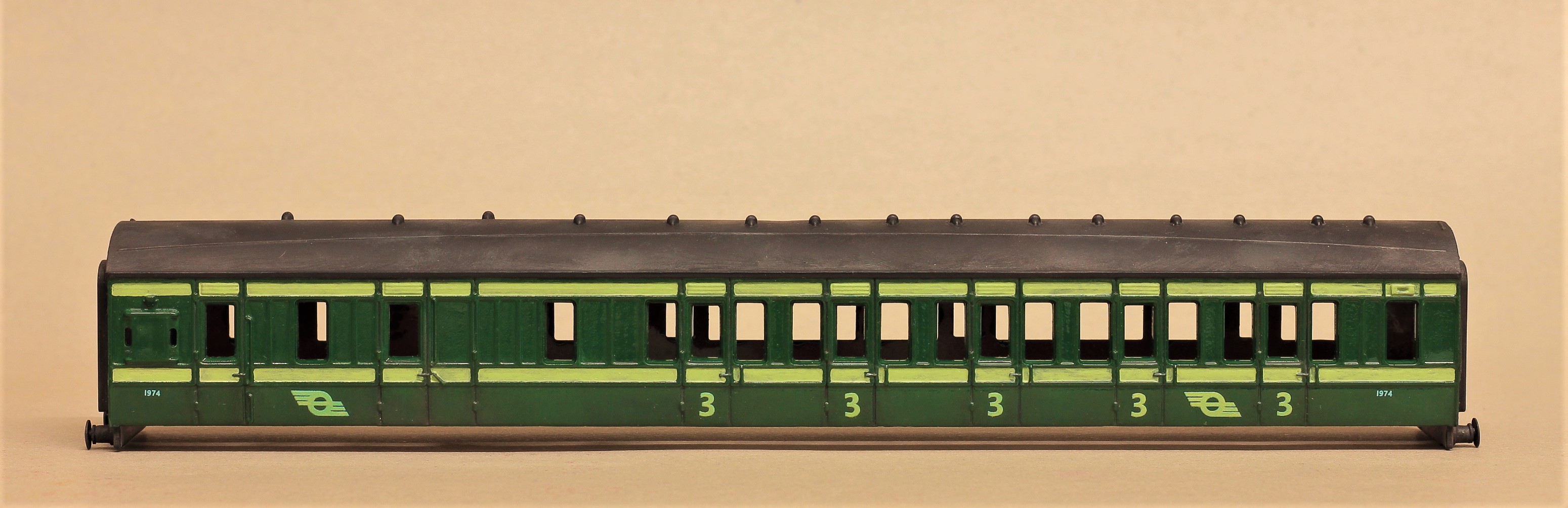
I have mixed some paint for EDN and have painted the stripes on a coach.
This is just a test to see what you think, i can adjust it later.
Also the photo looks very different from the model i painted so it's by no means exact.
-
1
-

CIE Locomotive Grey specification
in Irish Models
Posted
I took some pictures a while back.
Here are two that show the grey colour.