
jhb171achill
-
Posts
16,417 -
Joined
-
Last visited
-
Days Won
408
Content Type
Profiles
Forums
Events
Gallery
Blogs
Everything posted by jhb171achill
-
Into the Wesht

-
A trip into the past.
-
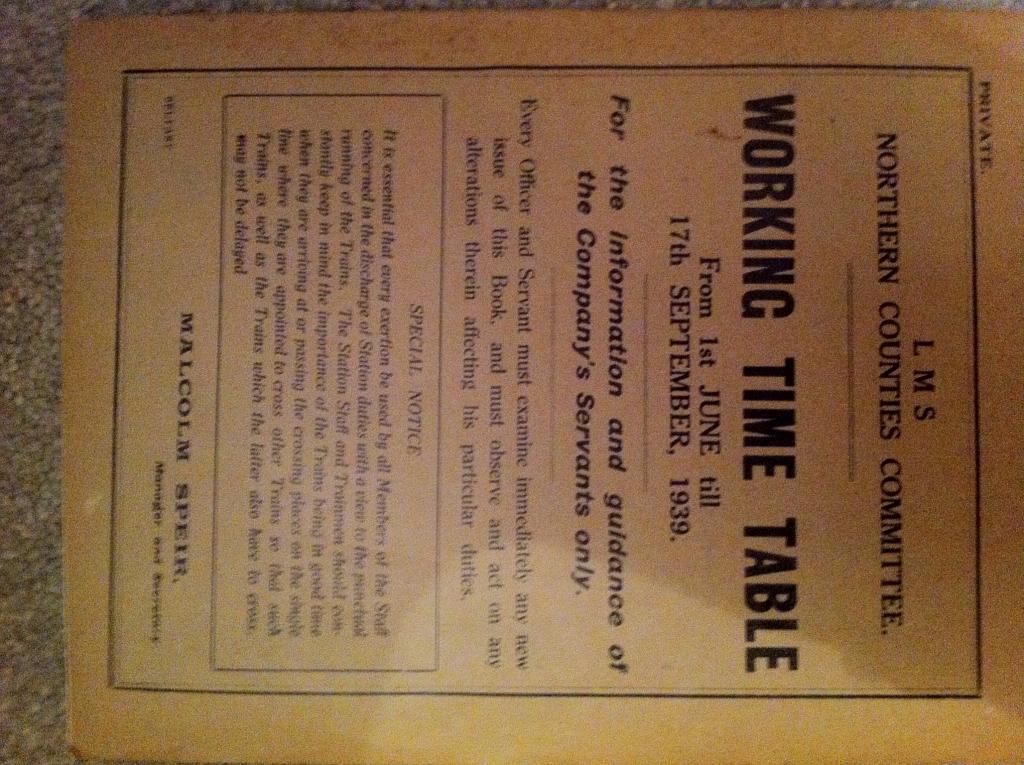
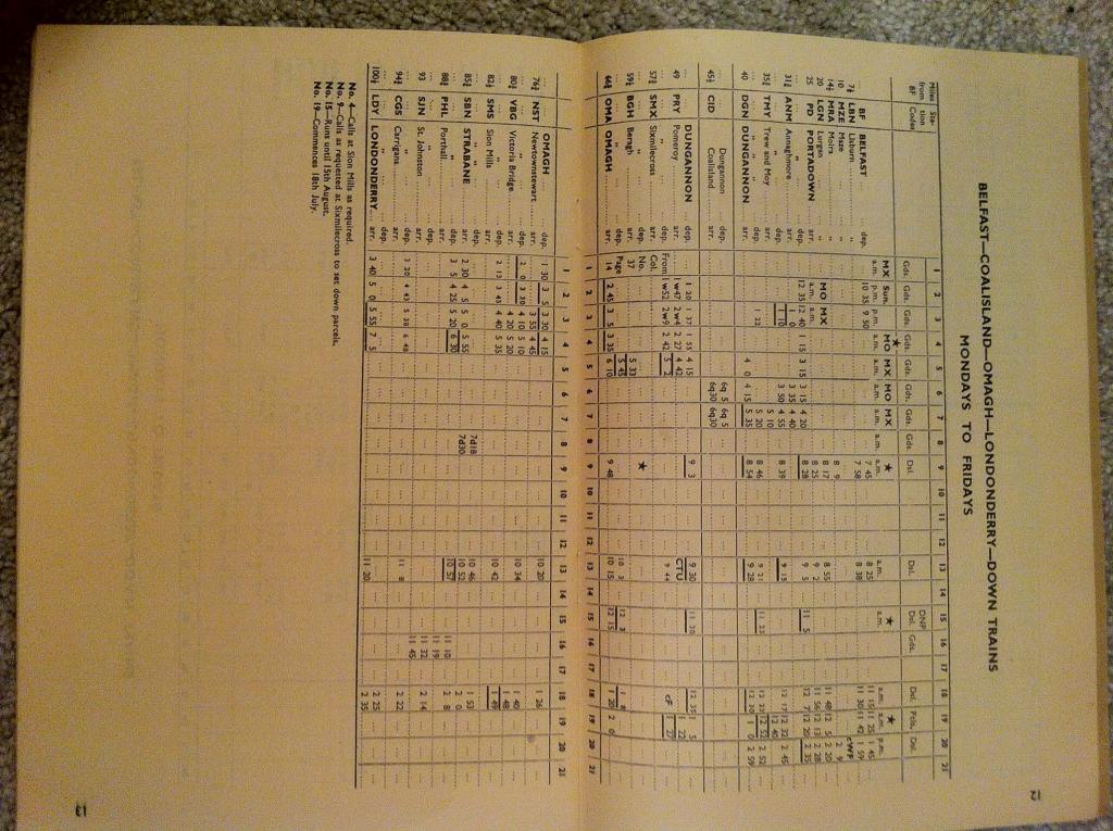
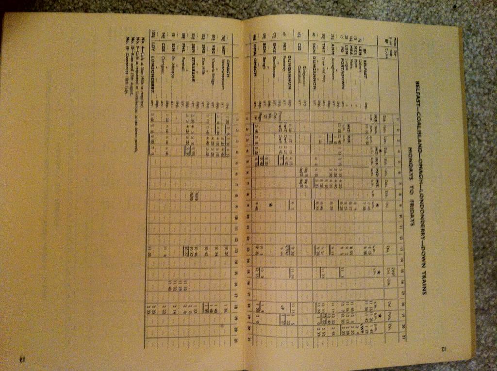
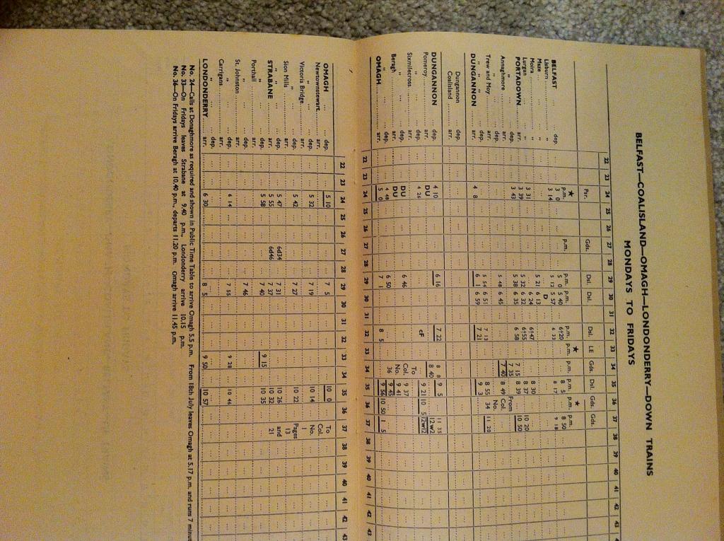
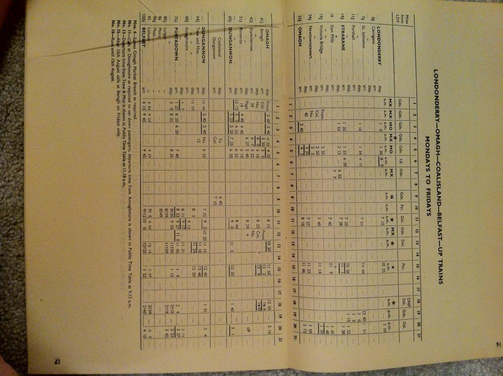
The heyday of the NCC. War clouds gather as maroon 2.6.0s speed back and forth between York Road and Derry, in half the time it takes nowadays.
-
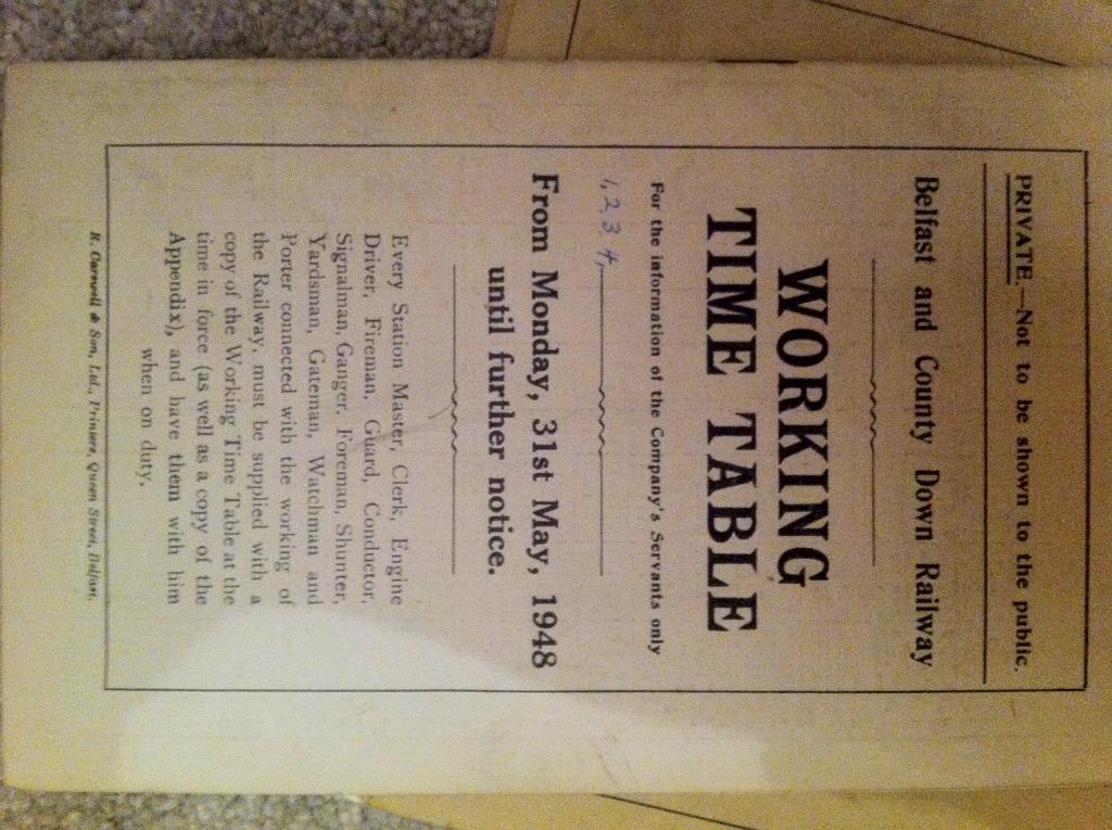
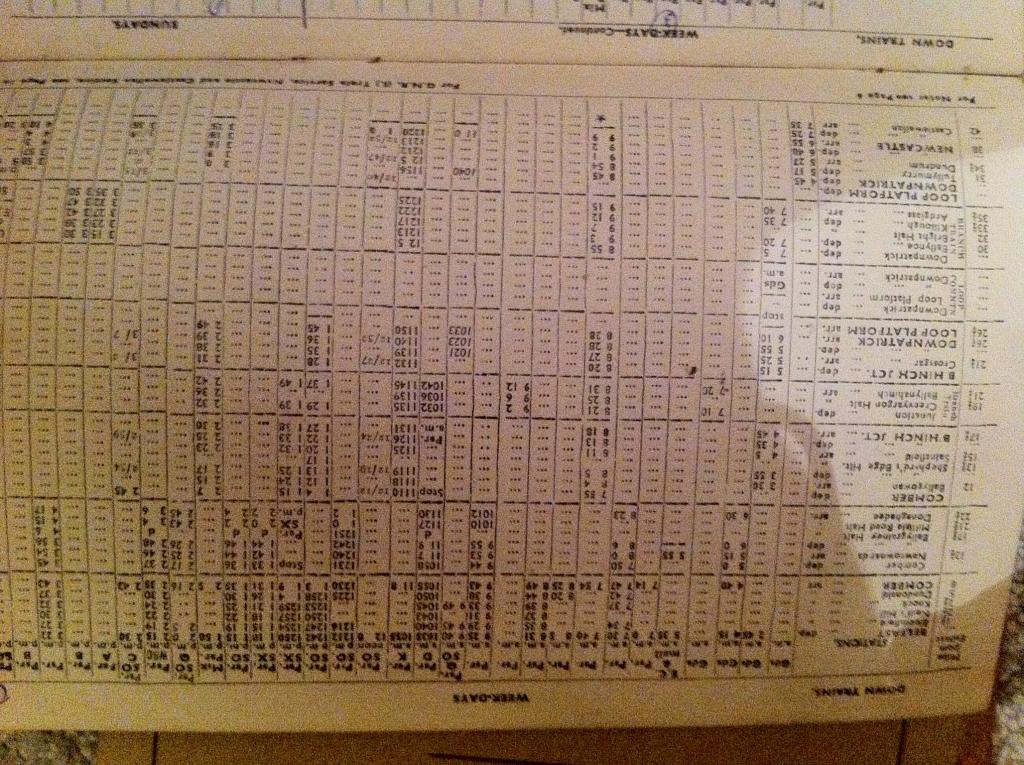
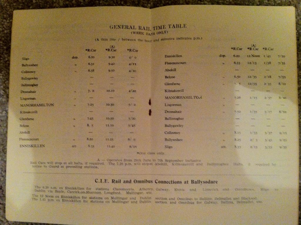
Twilight of the BCDR, six-wheeled heaven. I think they only ever owned about half a dozen bogie coaches, and they spent most of their time on the Bangor line. To keep their own six-wheelers company, in the 1910s / 20s they even also hired in half a food six-wheeled thirds each from the GNR and the MGWR.... A year after this timetable, the UTA (the UnderTAker) had taken over. Track was about to become forgotten weeds.
-
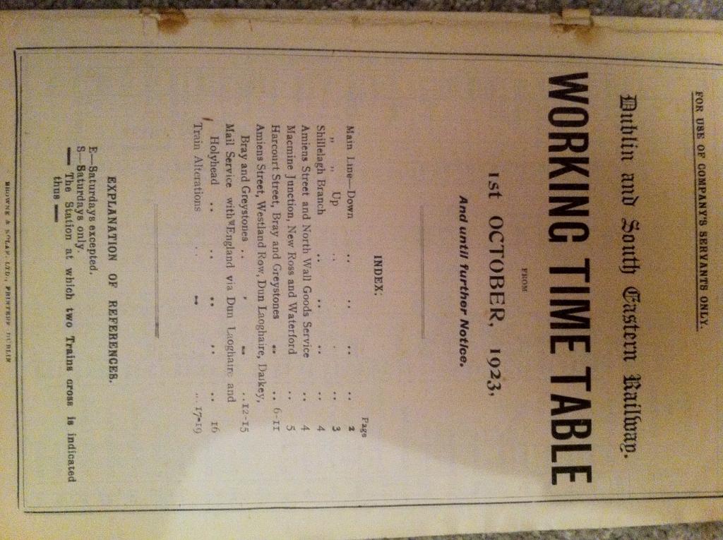
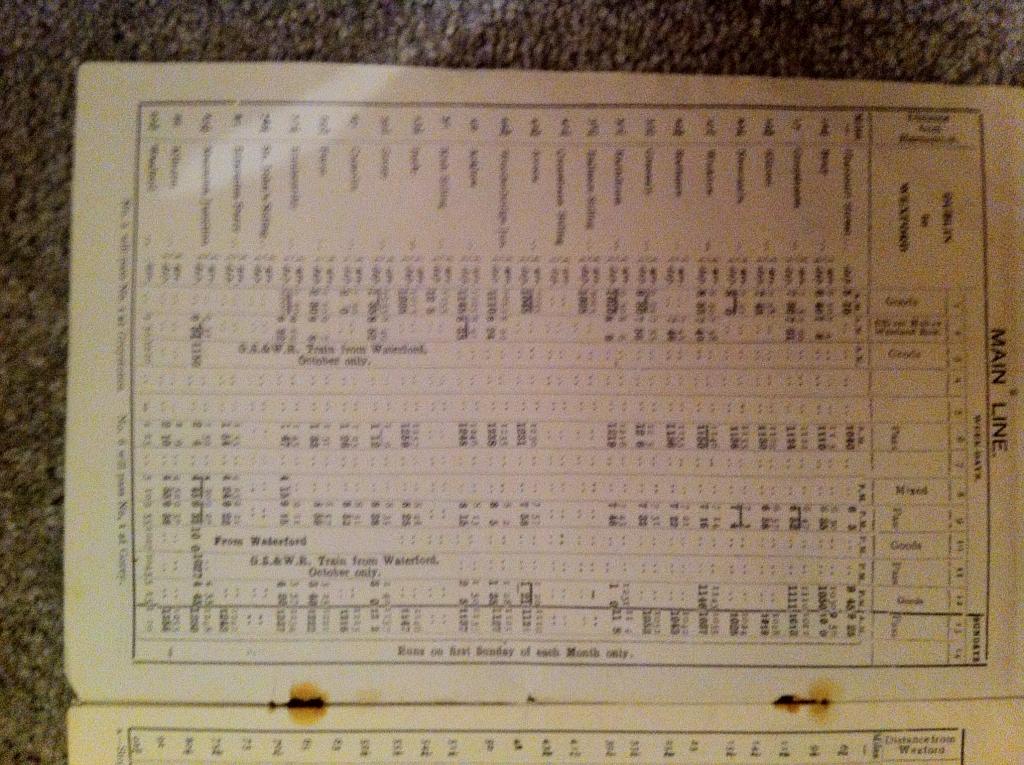
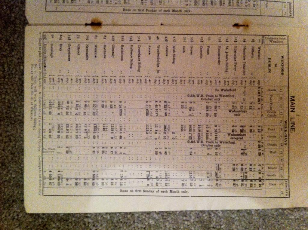
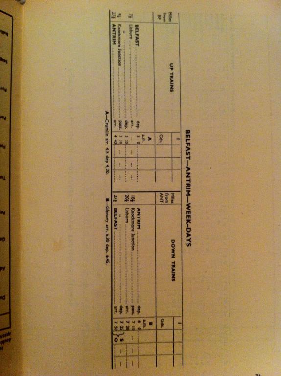
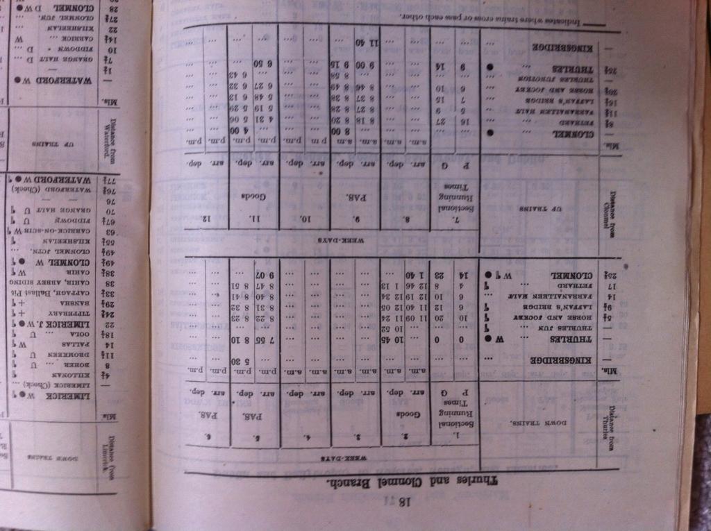
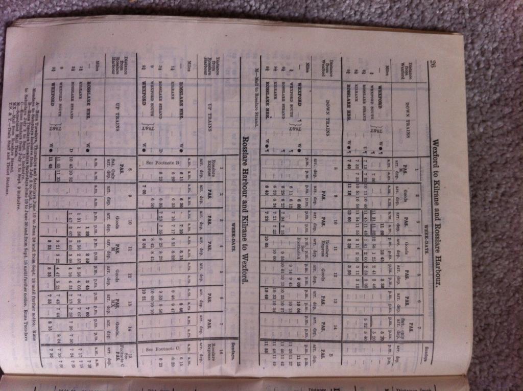
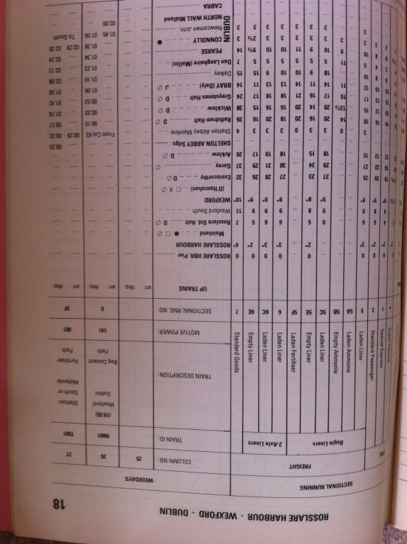
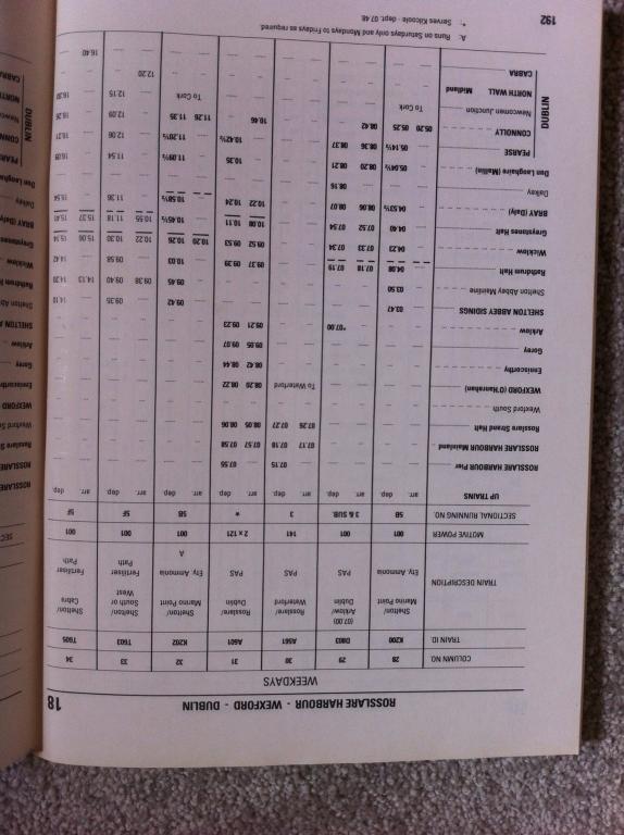
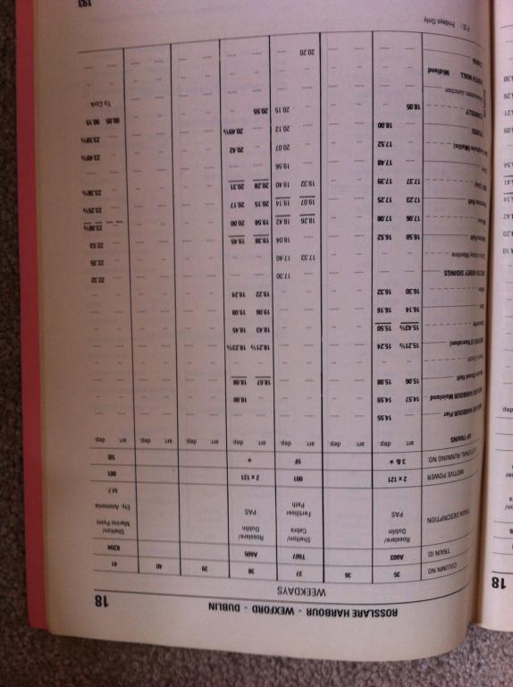
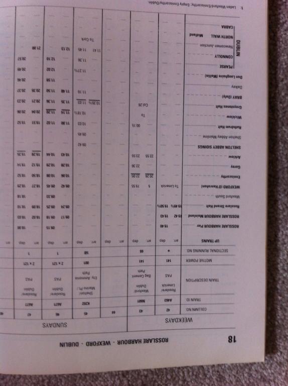
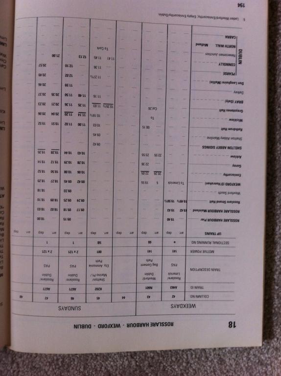
We've neglected the South Eastern a little. Small wonder, at the time thus timetable was published, there were severe disruptions to the service due to the "Troubles"!
-
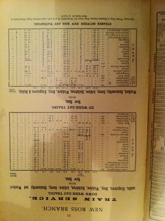
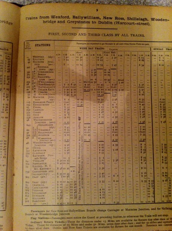
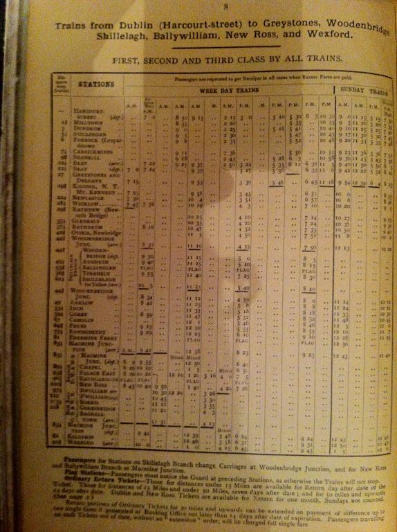
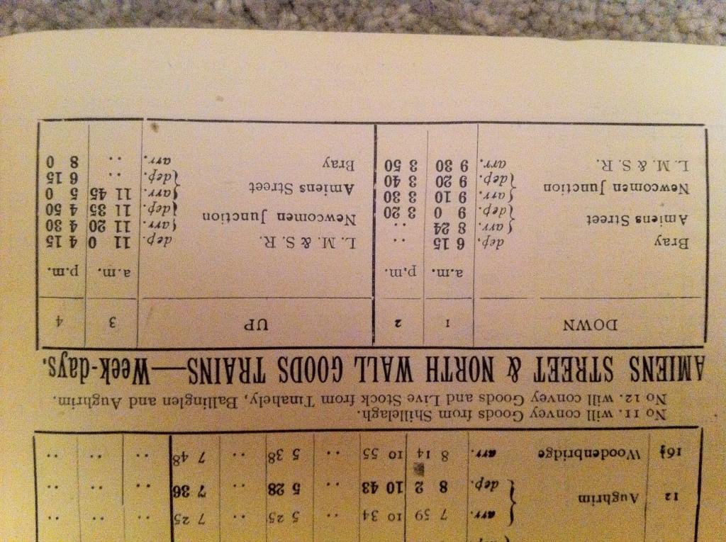
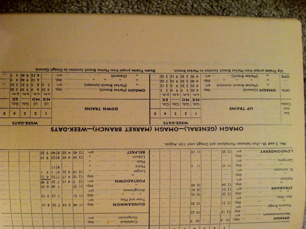
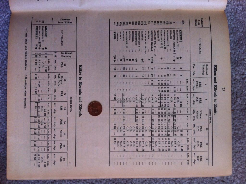
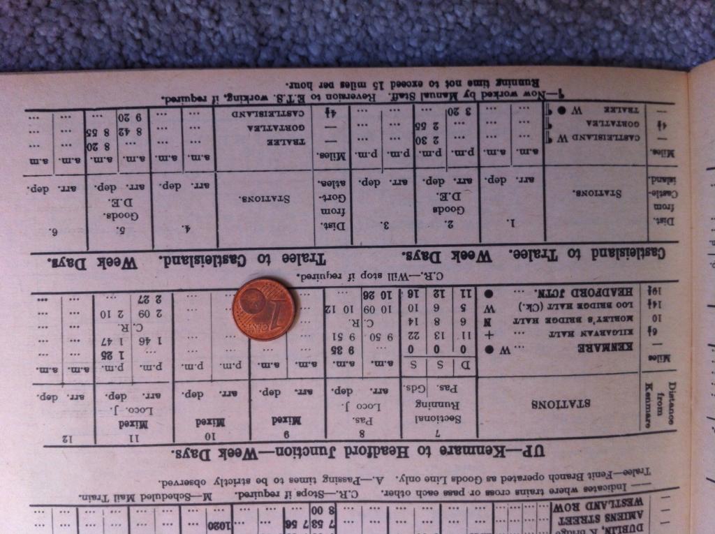
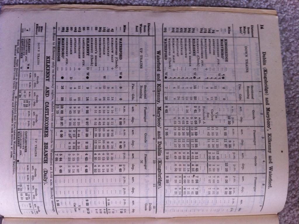
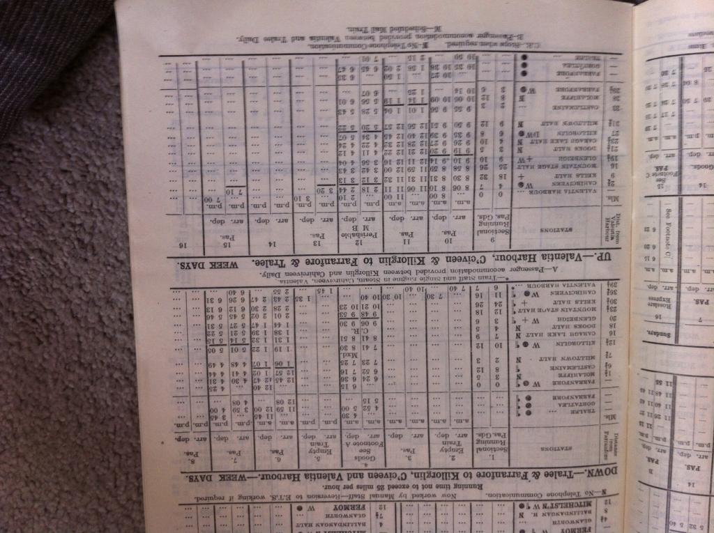
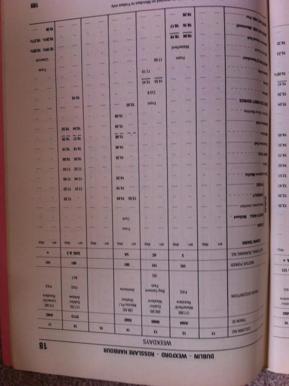
And one for David Holman. Oddly, the timetable I have is incomplete; it omits Arigna Road! But as we know, there were two mixed trains, an if-required goods, and a passenger train each day....
-
It's 1963. Green UTA railcars are now getting their "wasp" stripes, as ex-GNR AEC and BUT cars rule the roost on the ex-GNR sections, while noisy, badly ventilated, rattly MED cars convey the long-suffering to Bangor. A few ex GNR locos still grace Adelaide, a badly weathered faded blue 207 among them. Jeeps and Moguls are still to the fore on the old NCC, now Ireland's steamiest location. Old GNR and NCC coaching stock are to be seen on both sections, many distinctly past their best. Goods traffic is still busy, but lacks the modernisation showing in CIE goods trains. The UTA has, of course, an agenda; they'll eliminate it all in two years from now. MPD railcars have come of age, but in all their varied forms remain where they will spend their life - almost entirely on the NCC lines. Sleek new grey 121s appear the odd time with sleek new laminates intermingled with repainted ex-GNR coaches on the "Enterprise". The brighter CIE green is now giving way to a bold new livery; the black'n'tan era has arrived, even as the UTA still has 2 or 3 bogie coaches in traffic still in GNR brown.....
-
The Official Irish 'Might Have Beens' Thread
jhb171achill replied to minister_for_hardship's topic in General Chat
Not really getting at anything in particular, Leslie - just an over active mind wandering..... Youre right about the other bits...... If the border had never existed, all would have been CIE. In such a case, would all the AECs have fuel out and been replaced by an entire loco hauled railway with 141s towing laminates into Coleraine, Omagh and Larne? Belfast's suburbans would have been a loco spotter's paradise with C, 121 push pulls, 141s and 181s rattling about on the Bangor, Lisburn and Larne lines. Had the border existed, but for some reason had no impact at all on the railways, would we now have NIR operating the NCC, IE operating Connolly - Sligo and everything south of it, and a modern GNR operating the main line, INWR, Cavan and Portadown - Omagh? Just a thought. I'm sure freight would be there in some form in such a scenario - maybe still also on the NIR (NCC)! -
The Official Irish 'Might Have Beens' Thread
jhb171achill replied to minister_for_hardship's topic in General Chat
Imagine no border, or a border which had no effect on the railways. GNR survives, probably as part of CIE. What's left? Probably Dundalk - Enniskillen - Derry, and Portadown - Omagh. The INWR would be ICR country, possibly timber in Monaghan area..... CAF sets GVS - Omagh - Derry? North Wall - Derry containers? -
Absolutely superb. Those AEC cars were noisy, but by far the most comfortable railcars ever to operate anywhere in Ireland until, I suppose, the (utterly characterless) ICRs appeared.
-
Photographic Website Updates
jhb171achill replied to thewanderer's topic in Photos & Videos of the Prototype
I've seen that Transylvania tram on the 19:20 Galway - Kingsbridge a couple of times.... -
Go back to the black'n'tan era, and we have a typical mixed goods working with everything in the same train. H vans, opens with just about anything in them, flats with cars or tractors on them, four wheel container flats, a few wagons of beet, a tar wagon and a couple of bubbles!
-
David, I'm sure you have SLNCR ones anyway - if not, I have a few and could post here if of any interest.
-
That snail faces the right way, but it's the wrong shape, far too big, wrong colour and unlined; the cab number is the wrong size, font and colour too! The loco should have been all grey also, not black, if in fine livery. But to be fair nobody ever tried to pass off those early models as anything other than a broad "toy" representation. Interesting model, though. For record, snails were light green, lined in gold, and numerals were unlined pale yellow.
-
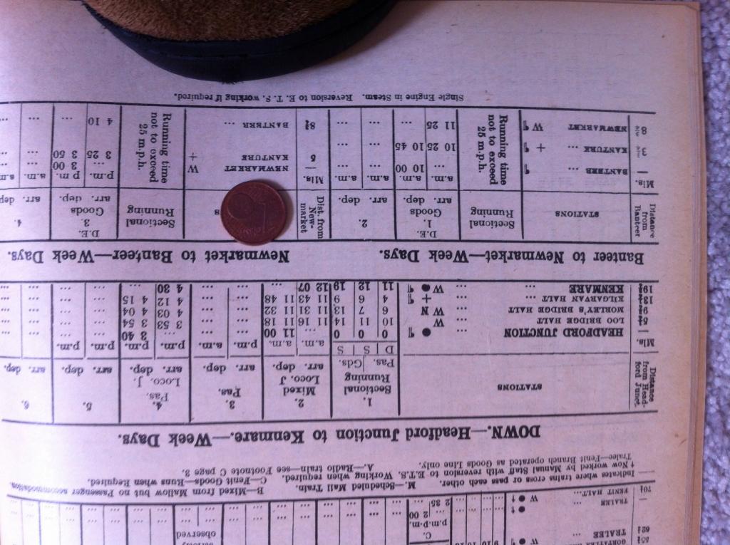
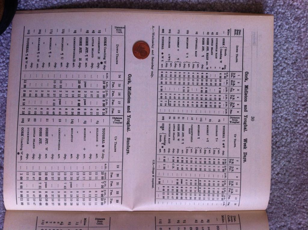
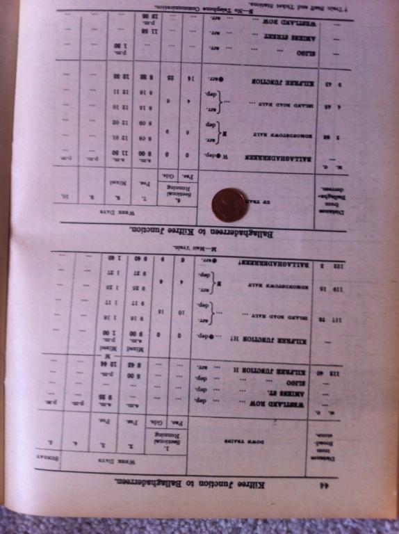
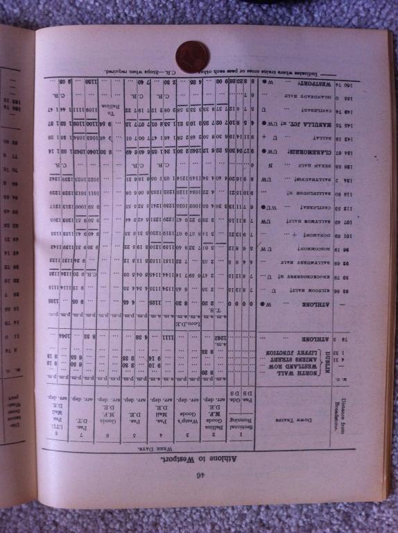
TRY AS I MIGHT, I CAN'T GET THESE WRETCHED THINGS TO APPEAR THE RIGHT WAY UP!!!!!!!!!!! I'll post this last batch and then I'm going for a pint. Hoping to pick up a model of 800 tonight. See my notes in a number of earlier posts explaining why I'm posting these, and what the coins mean..... denoting different years.
-
See notes in earlier posts about who I'm answering, and what the coins mean!
-
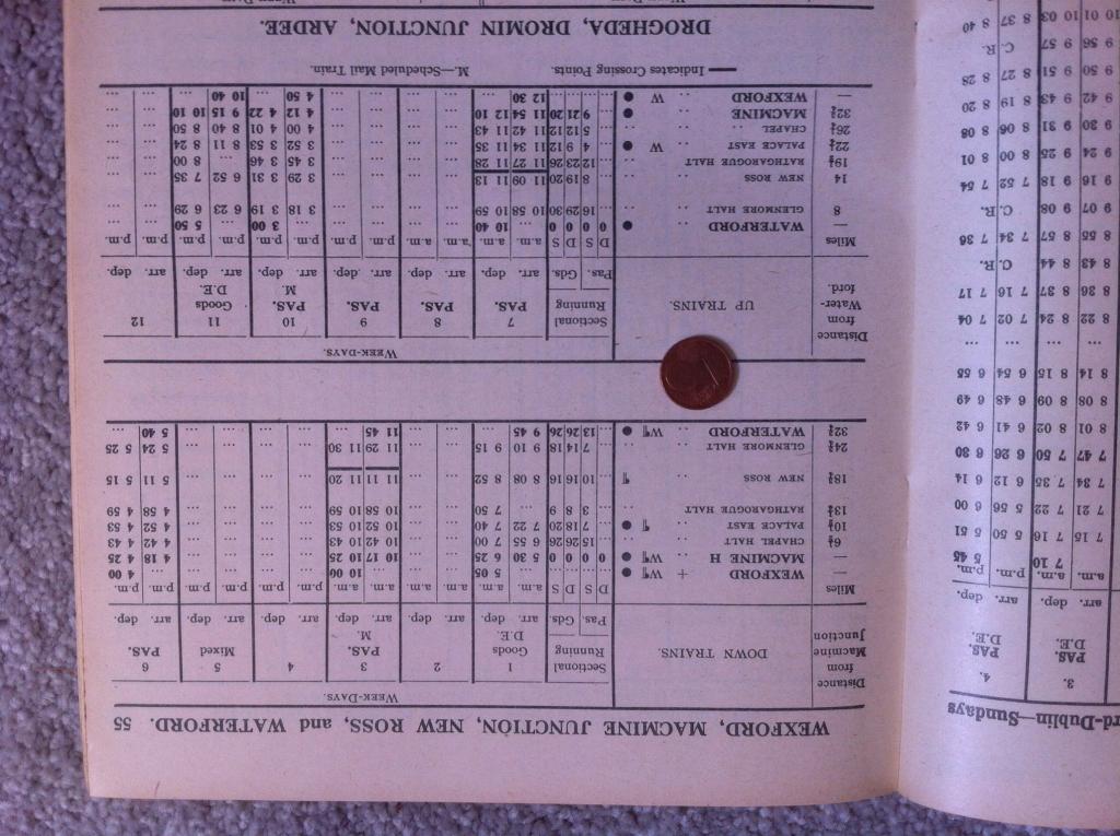
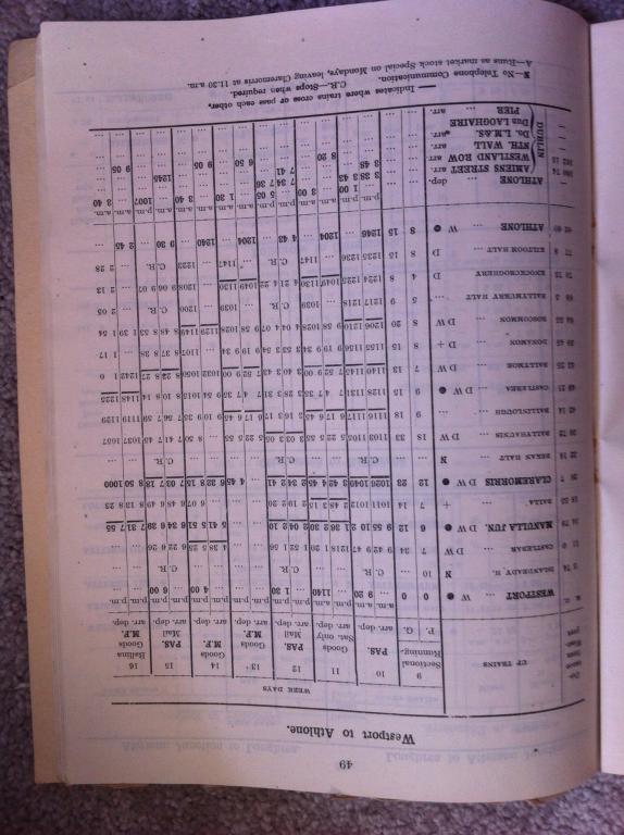
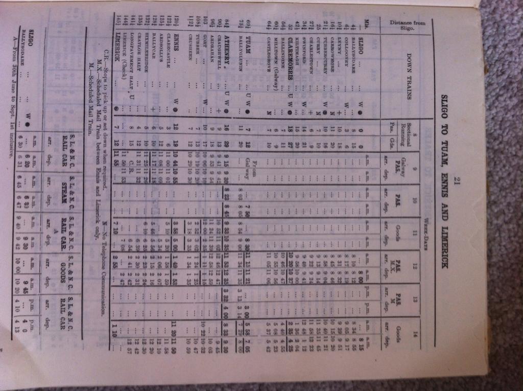
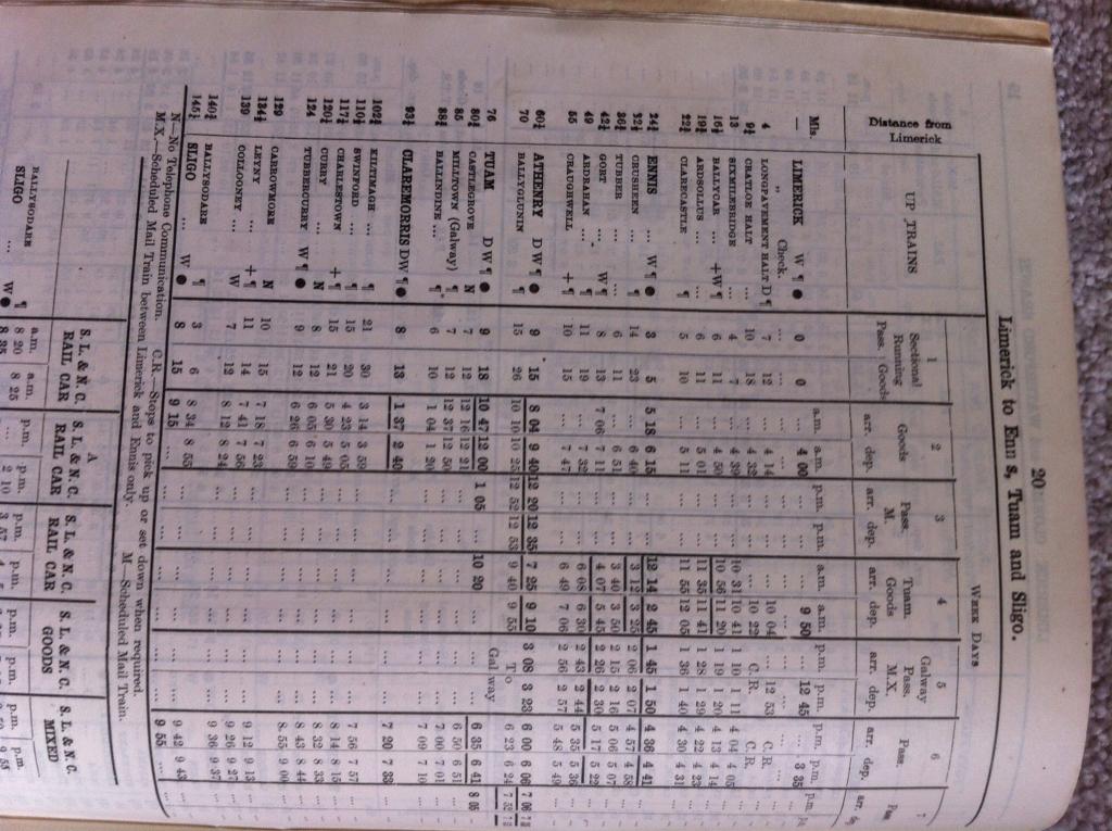
The odyssey continues - see my notes several posts ago about which years each timetable relates to.
-
Note that on the sides of steam loco tenders, and occasionally (but not always) AEC power cars, the snail was sometimes reversed to face front. Not on wagons, diesel locos, coaches or anything else. The Bachmann coaches with snails have them far too big. I'll try to get exact dimensions - my own original one has found a new home! On wagons, after about 1959, snails were stencilled rather than painted on. COLOURS Snails: On buses, carriages and steam locos of grey, green or black - eau de nil lined gold. Never white. After 1955, sometimes unlined on coaches. On wagons, light green or white between 1945 and early to mid 50s, then white. The white weathered so very quickly to a dirty off-white, that a model with a clean white one actually looks odd! Broken Wheel: white lettering, surrounded tan on diesel locomotives - never all white. On AEC power cars, white letting surrounded with black. On wagons, generally white letters with tan surrounds on grey wagons, but when they we painted brown, always all-white. Occasionally, but not often, an all-white one appeared on grey wagons, especially guards vans. I never saw an "H" van in grey with an all white logo.
-
On to 1c times.... 1951. Mostly steam.
-
Belonging to last lot...
-
Continued:
-
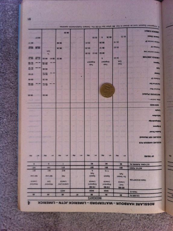
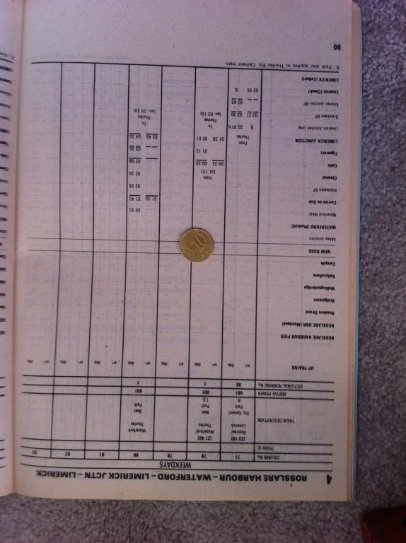
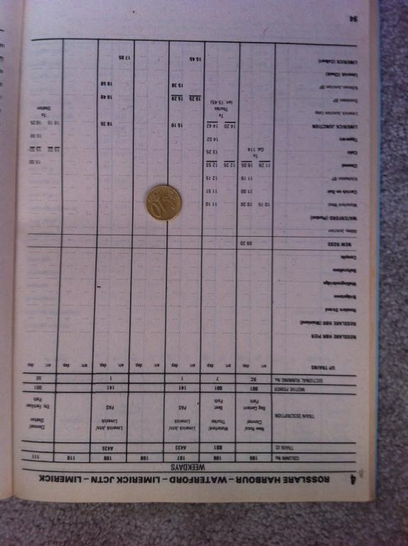
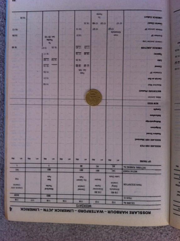
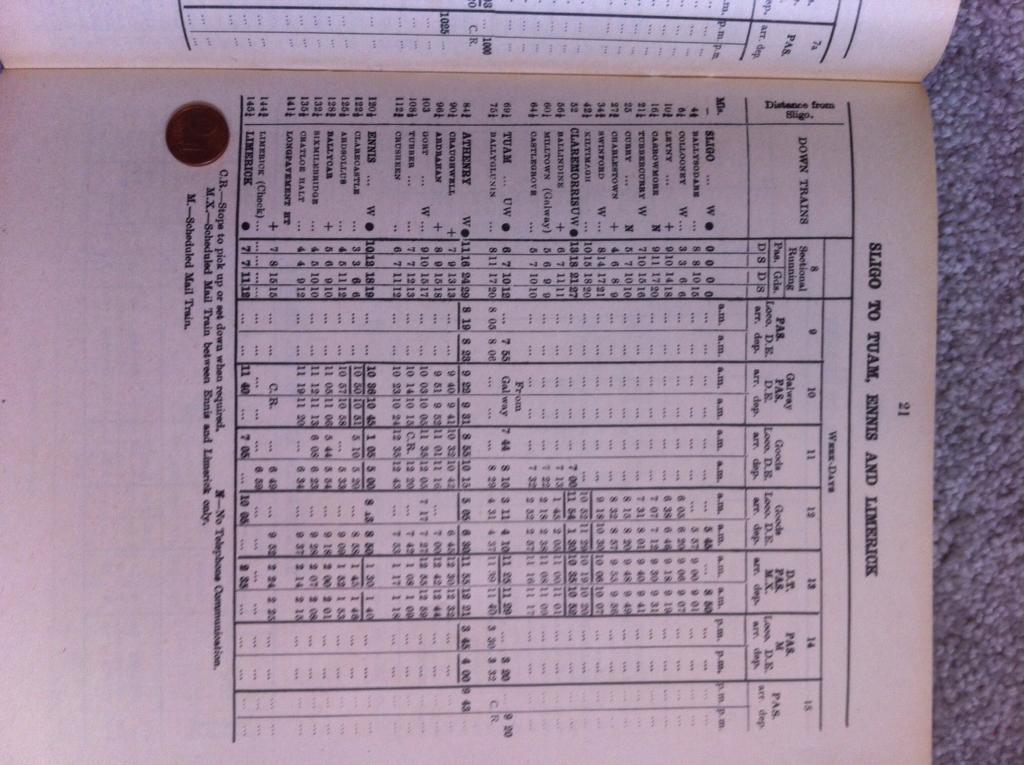
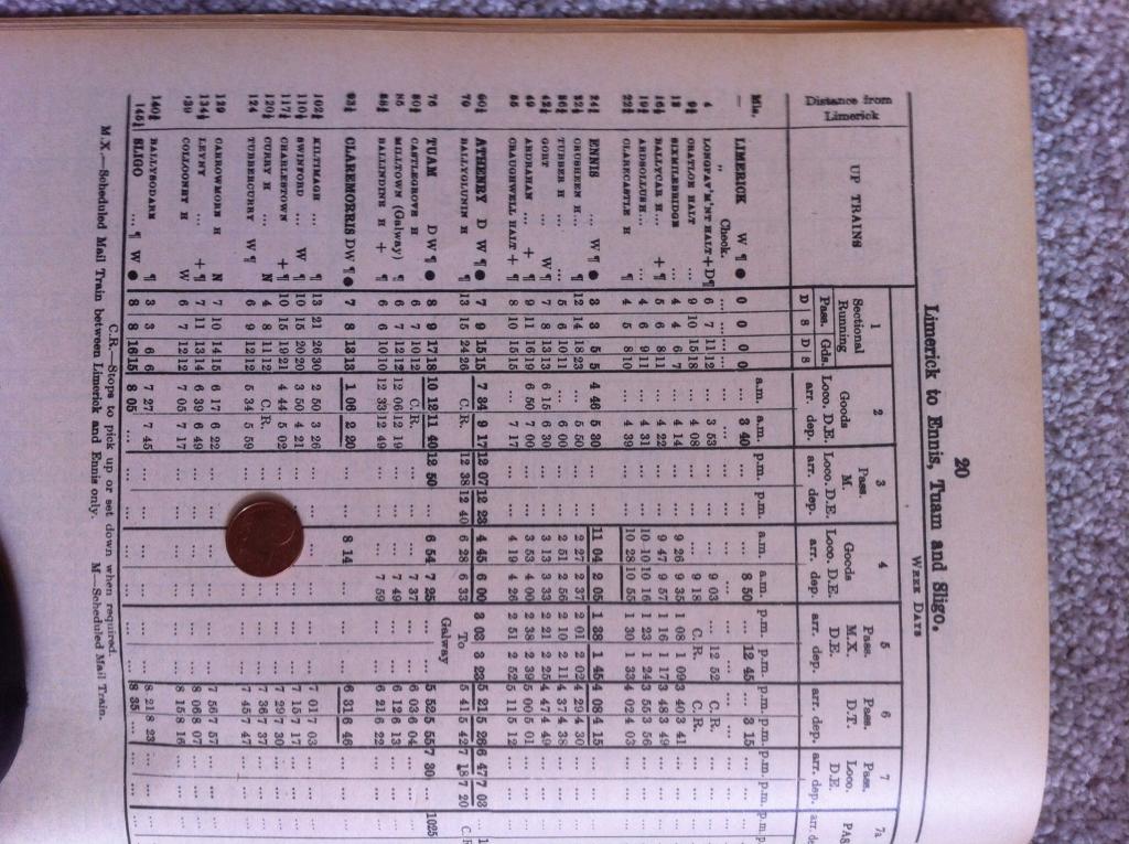
Next lot 1951 (without coin), 1959 with 1c coin. [ATTACH=CONFIG]20729[/ATTACH] [ATTACH=CONFIG]20730[/ATTACH] [ATTACH=CONFIG]20731[/ATTACH] [ATTACH=CONFIG]20732[/ATTACH] [ATTACH=CONFIG]20733[/ATTACH] [ATTACH=CONFIG]20734[/ATTACH] [ATTACH=CONFIG]20735[/ATTACH]
-
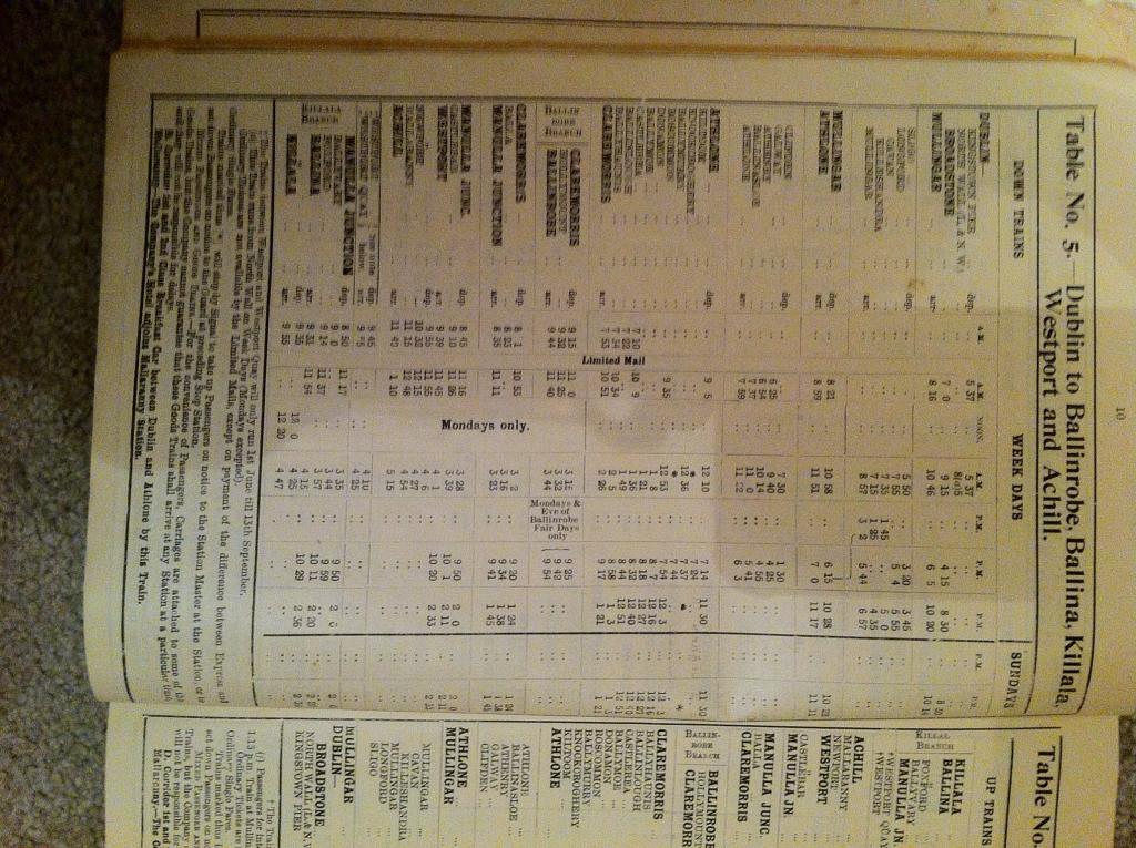
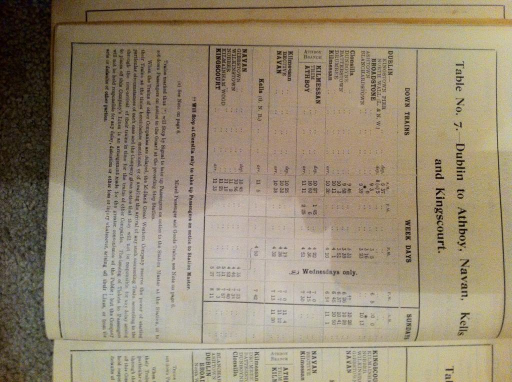
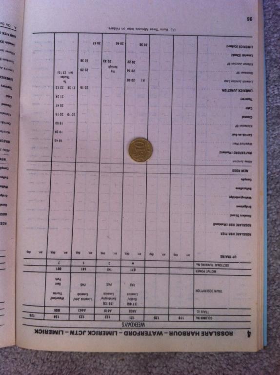
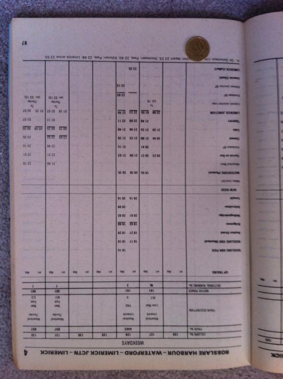
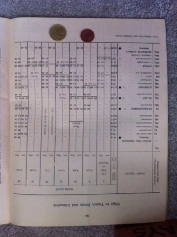
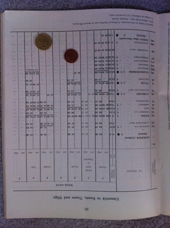
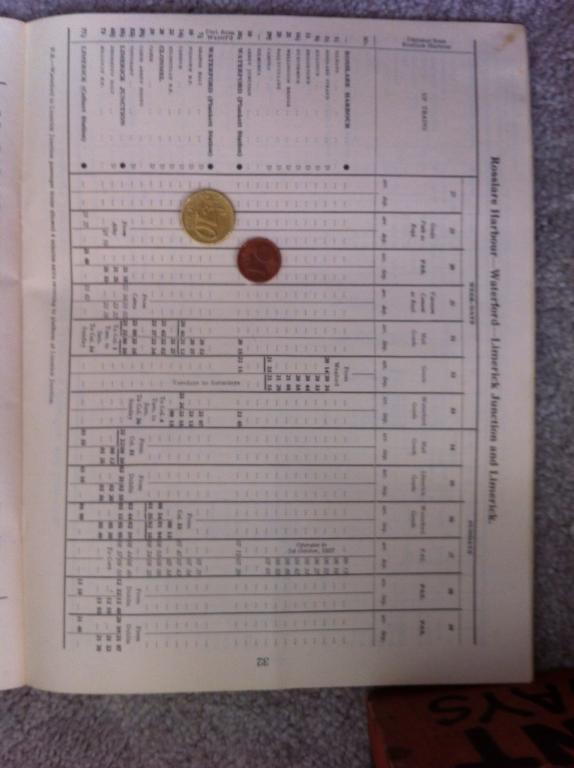
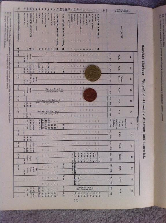
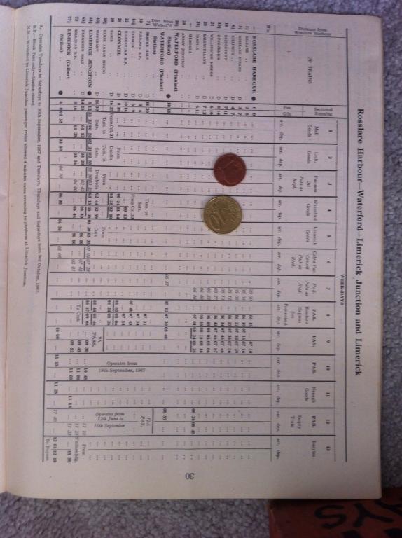
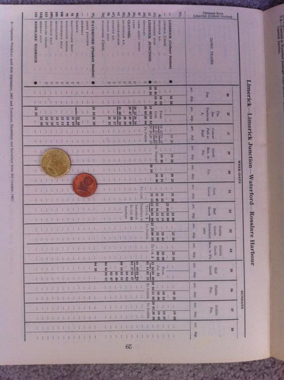
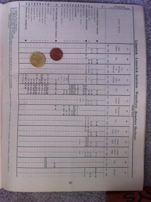
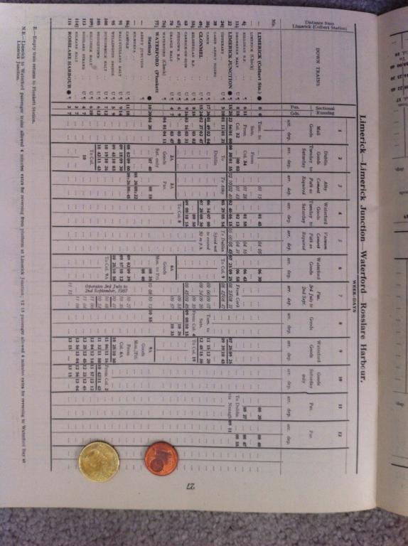
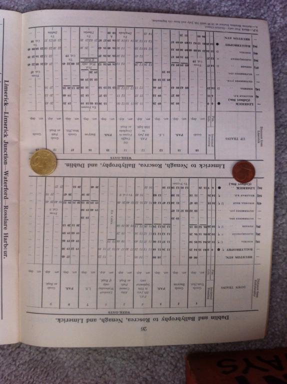
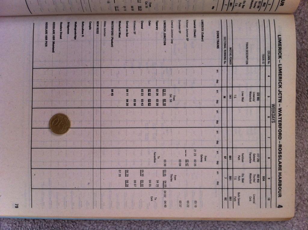
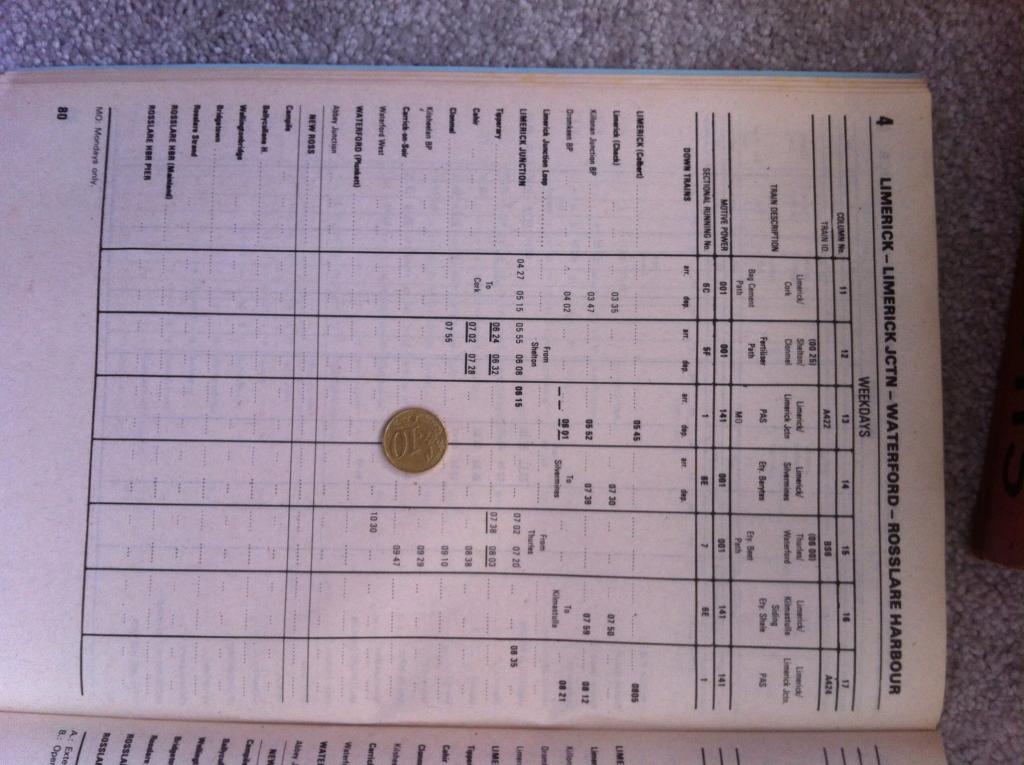
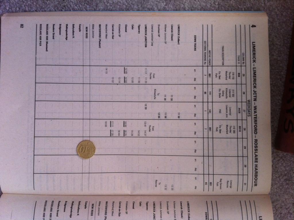
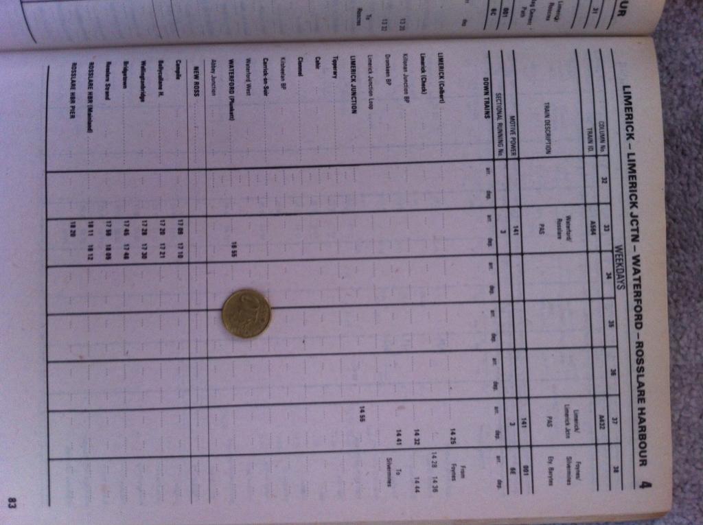
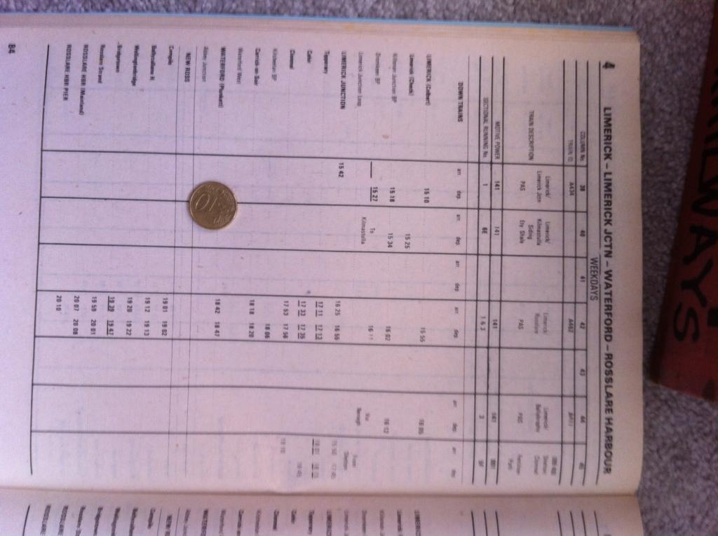
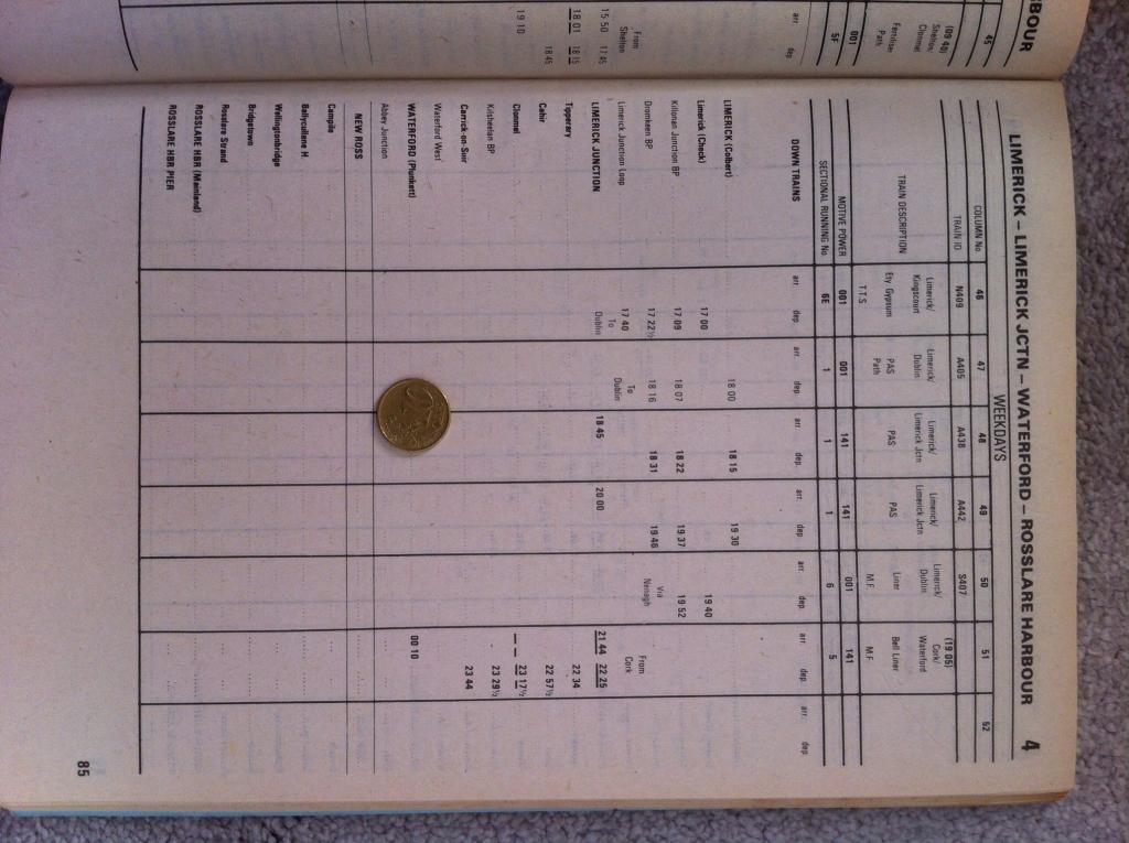
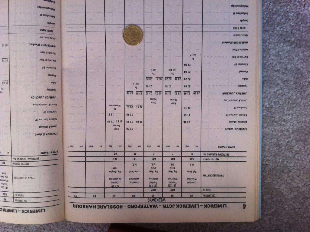
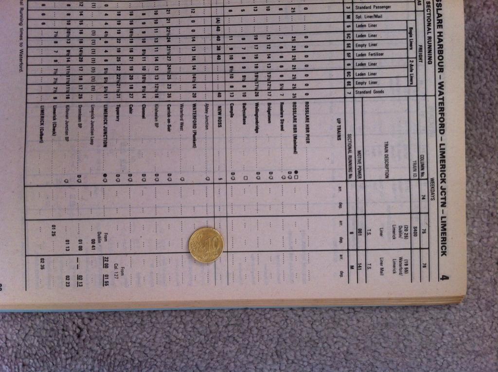
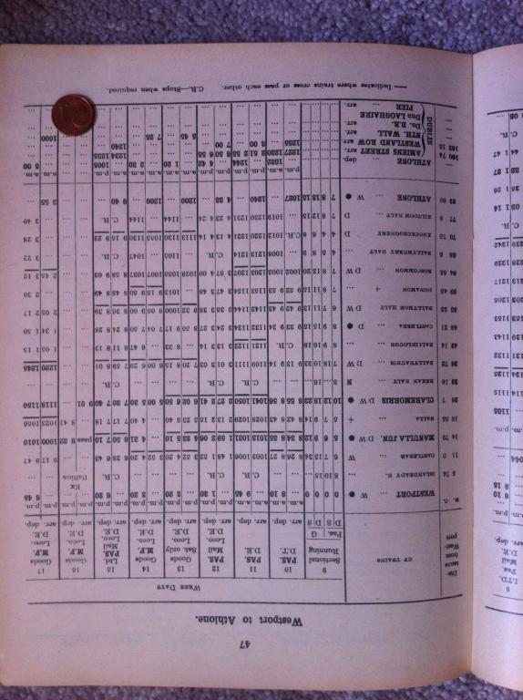
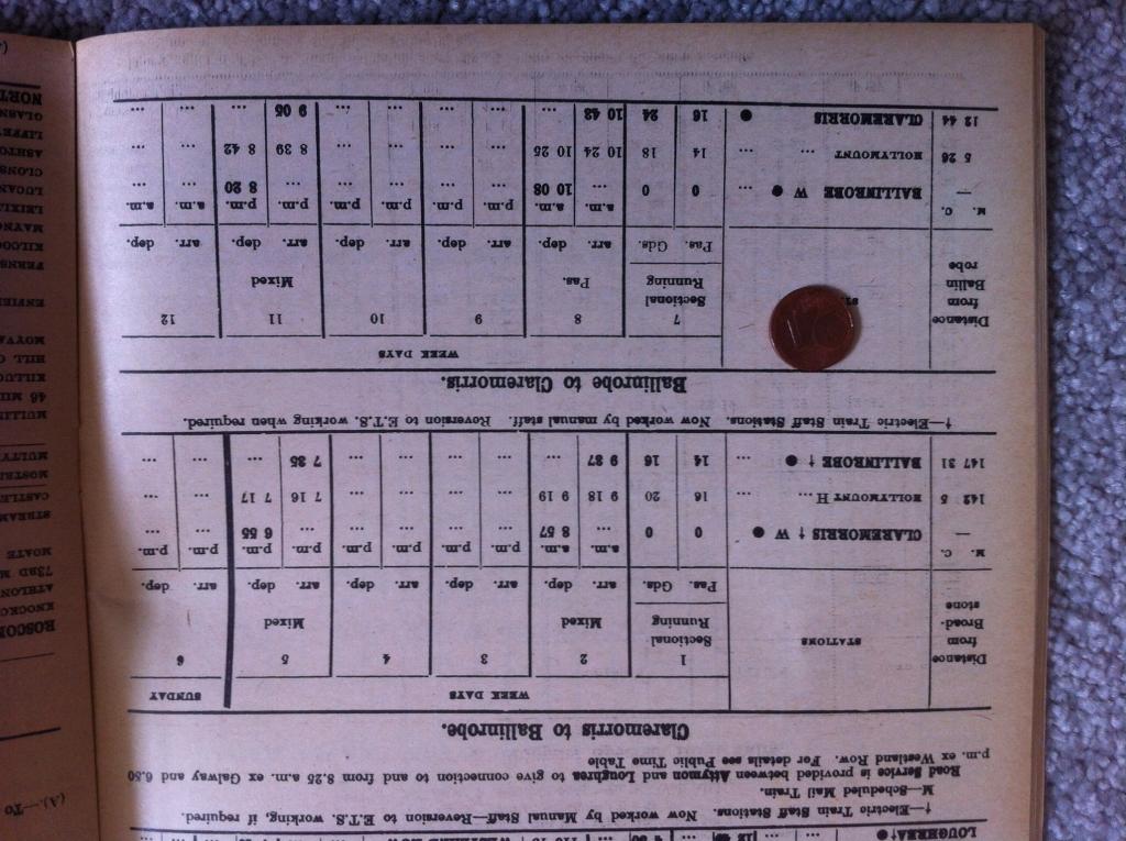
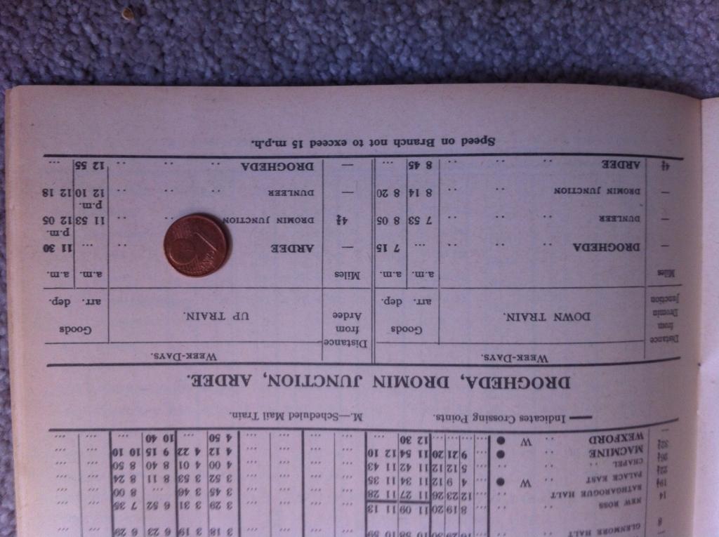
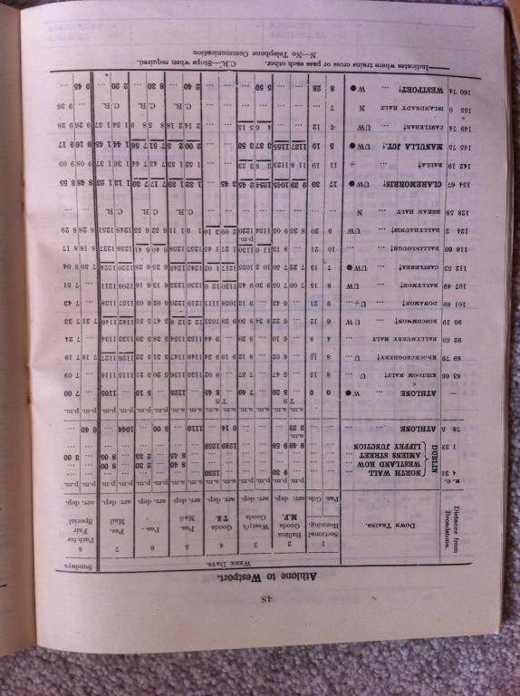
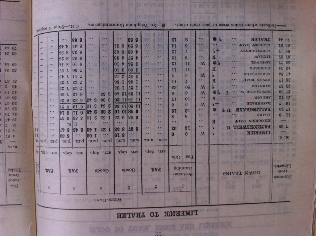
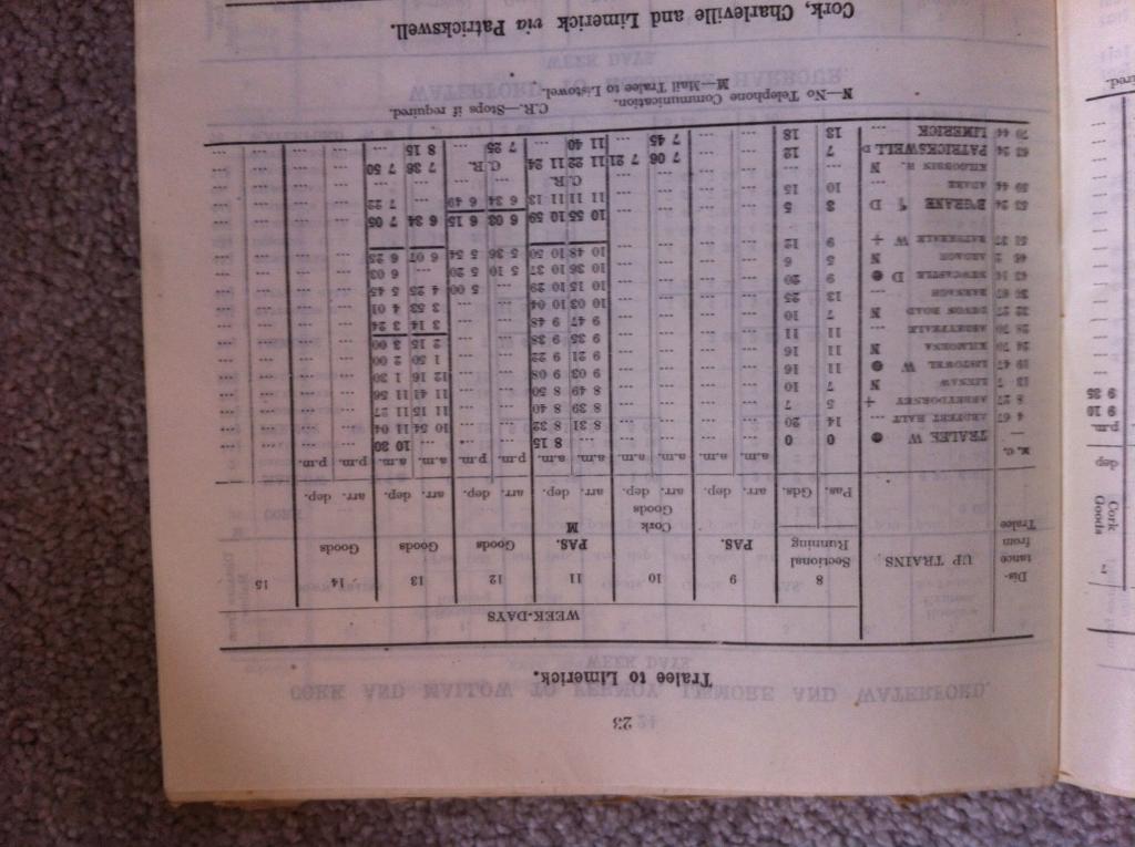
Further to my earlier posts, herewith some information hopefully of interest. I have included 1986 Connolly - Rosslare (for Dave182; I've nothing later than that!), plus for Stephen I have Limerick - Rosslare from 1951 (with 1c coin), 1959 (with 10c coin), and some other stuff from 1967 (with 1c and 10c coins). This will include Limerick - Sligo and Dublin - Westport, for junctionmad's request about Claremorris. There's also a Claremorris - Ballinrobe timetable in there. So here goes. This first lot are all 1986.
-
That's it, Mayner, thanks.
-
The Official Irish 'Might Have Beens' Thread
jhb171achill replied to minister_for_hardship's topic in General Chat
The GNR senior management (and I knew several of them in later years, so this is from the horses mouth), would have very definitely gone ahead with full dieselisation after 1953, had the funds been made available by Dublin and Stormont. While they did look into various options, the strongest probability was a great many more AEC and / or BUT cars for ALL passenger trains. Thus, they would have gone down the road of the UTA in turning passenger work over to railcars. We would probably have seen a CIE / UTA / CDRJC style conversion of many varied older loco-hauled coaches to railcar trailers and intermediates. A truly Irish phenomenon. Goods would most likely have ended up in the hands of a mixture of German and British built locomotives - goodness knows of what design. Strangely, among the paperwork of a former (Dundalk) Works Manager, an old family friend, no mention was made of shunting engines! So a GNR which survived could have seen a 1966 dawning with a handful of old steam engines used for little more than shunting about Dublin, Belfast or Dundalk. Possibly the "Enterprise" might have retained loco haulage, however both CIE and the UTA used railcars on it in the 60s! Had the bulk of the GNR lasted longer, what of containerised goods traffic?