
jhb171achill
-
Posts
16,421 -
Joined
-
Last visited
-
Days Won
408
Content Type
Profiles
Forums
Events
Gallery
Blogs
Everything posted by jhb171achill
-
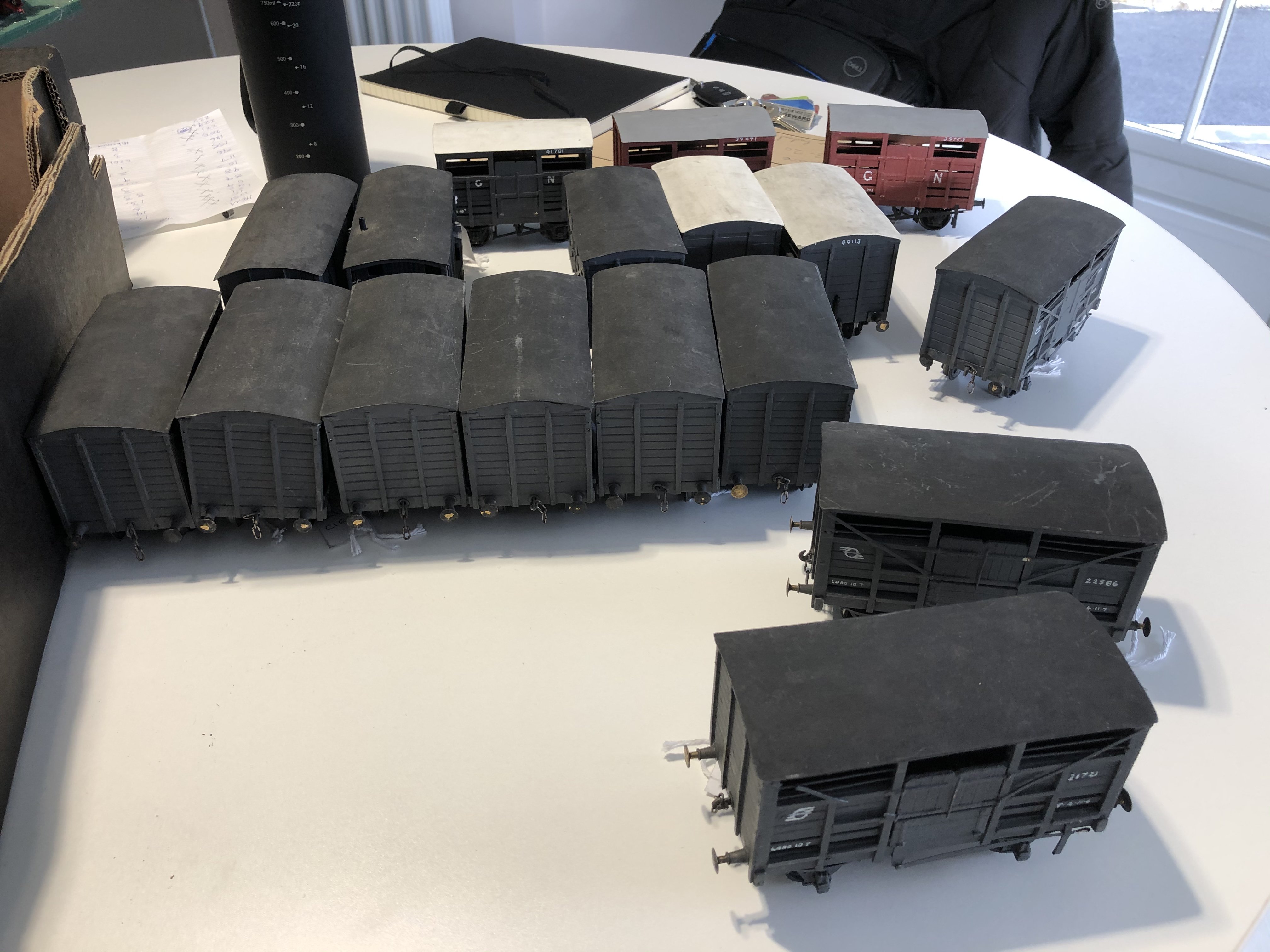
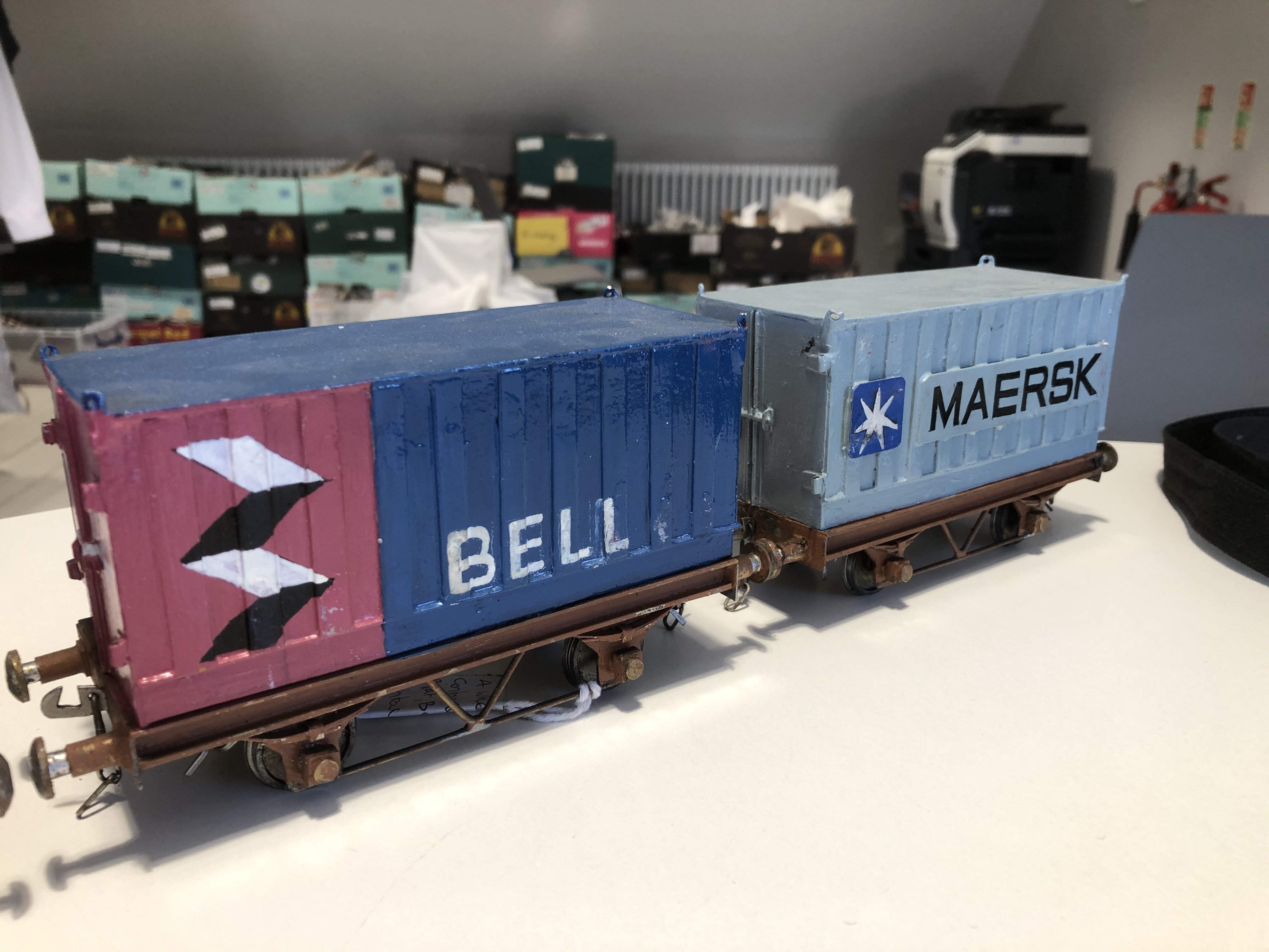
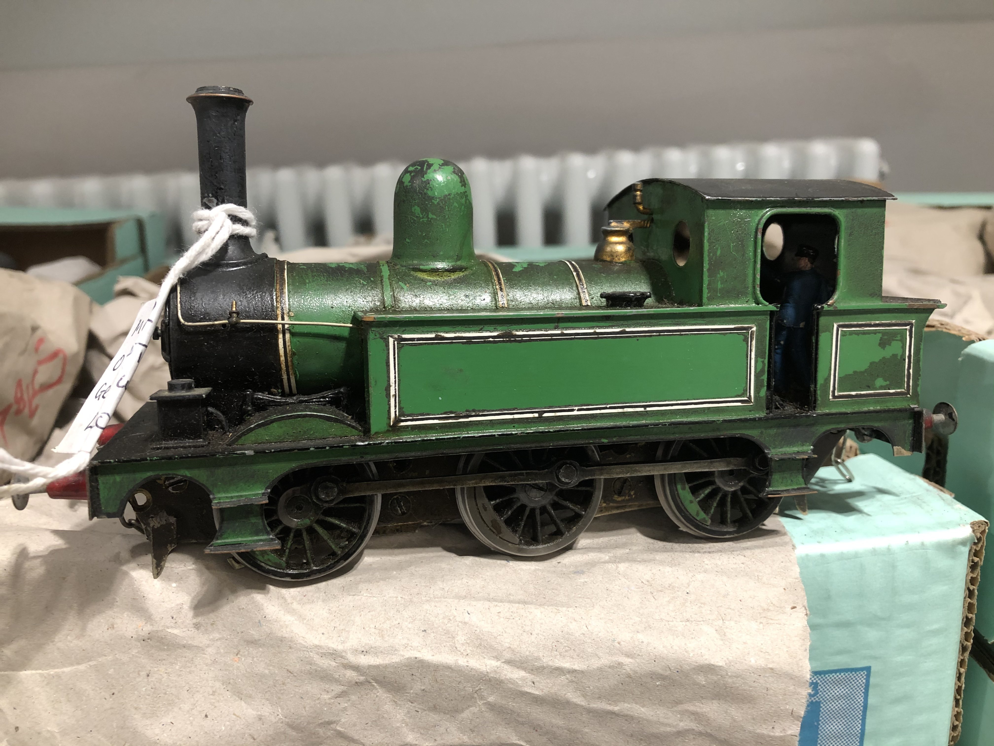
A few more of the “Castle” models. Wagons galore! CIE “H” vans, and cattle wagons of both GNR and CIE provenance.

-
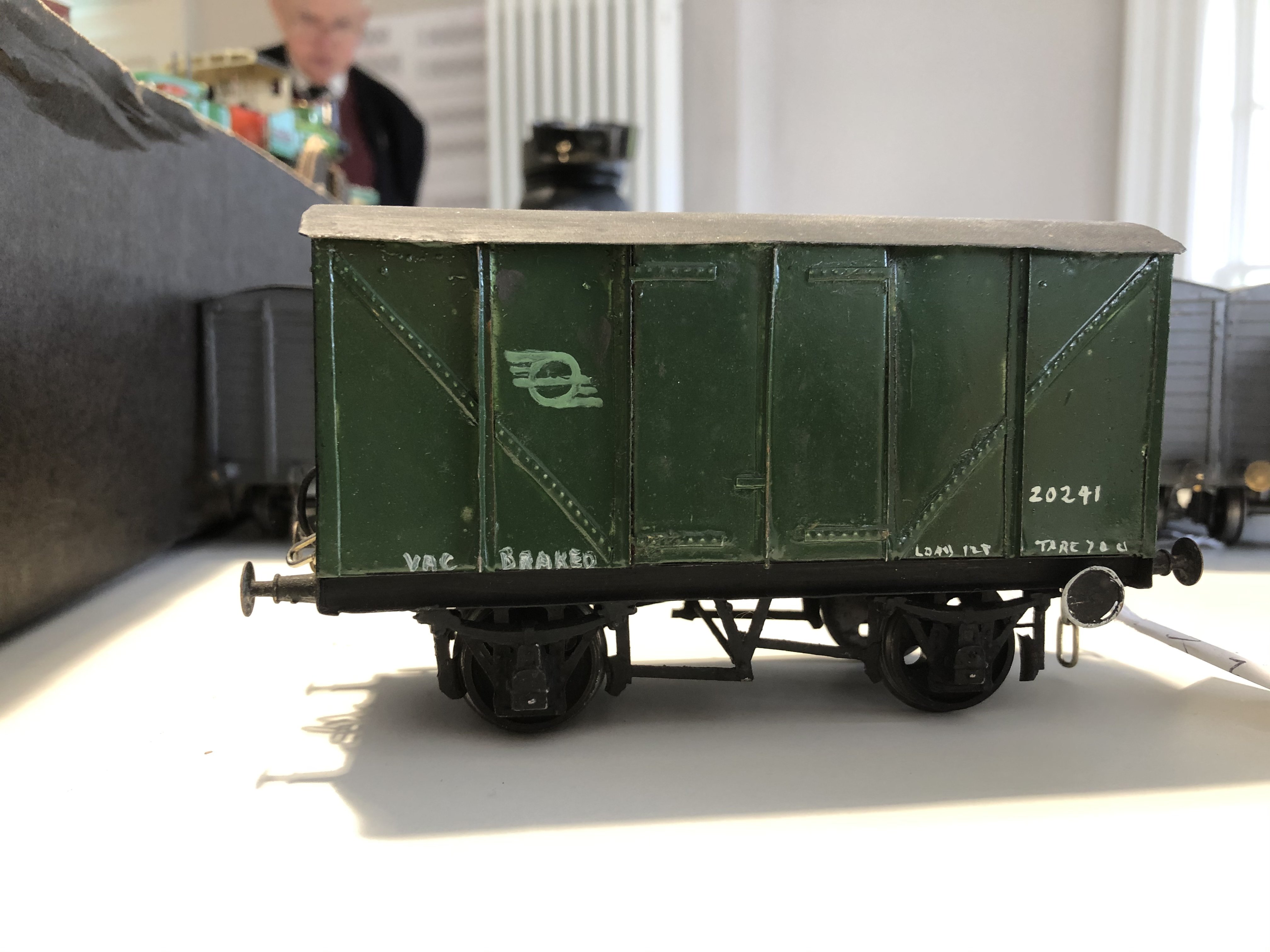
In the mid or late 1950s, for a very brief period, CIE painted at least two standard “H” vans green to match passenger stock. One was based in Cork, one in Tralee. They were attached to the back of the AEC set doing the Cork-Tralee and Tralee-Cork trains which carried mailbags. This isn’t a “Fry” model, but one of the “Castle” models made by one of the “Castle modellers”; Messrs. Connaughton, Tighe, Magowan, McGlynn and others. For those who knew some of these good folks, there are several models of this era with the initials “A I M” on them. Does anyone know who this was? Maybe one of the Magowans? Any information gratefully received.
-
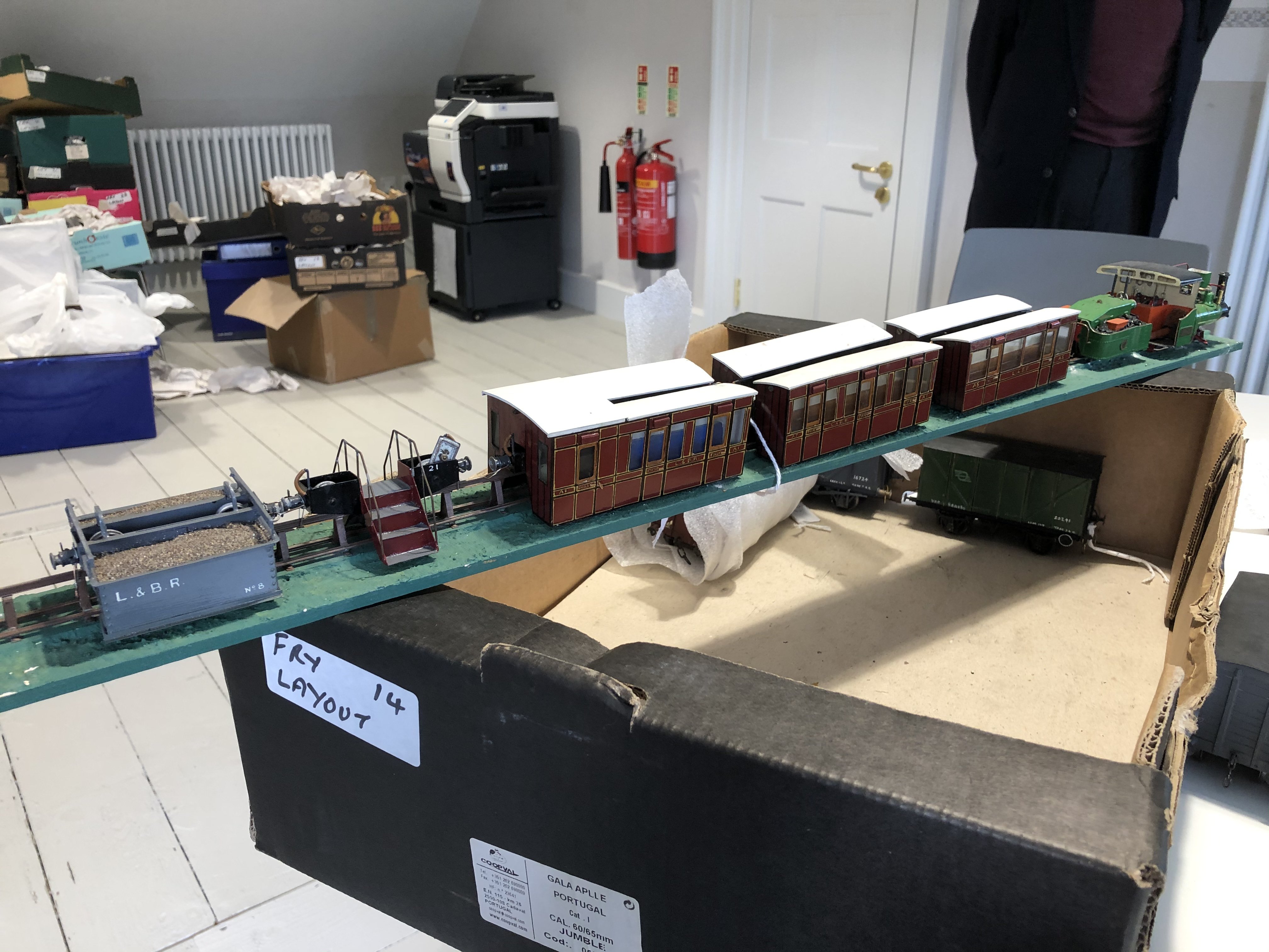
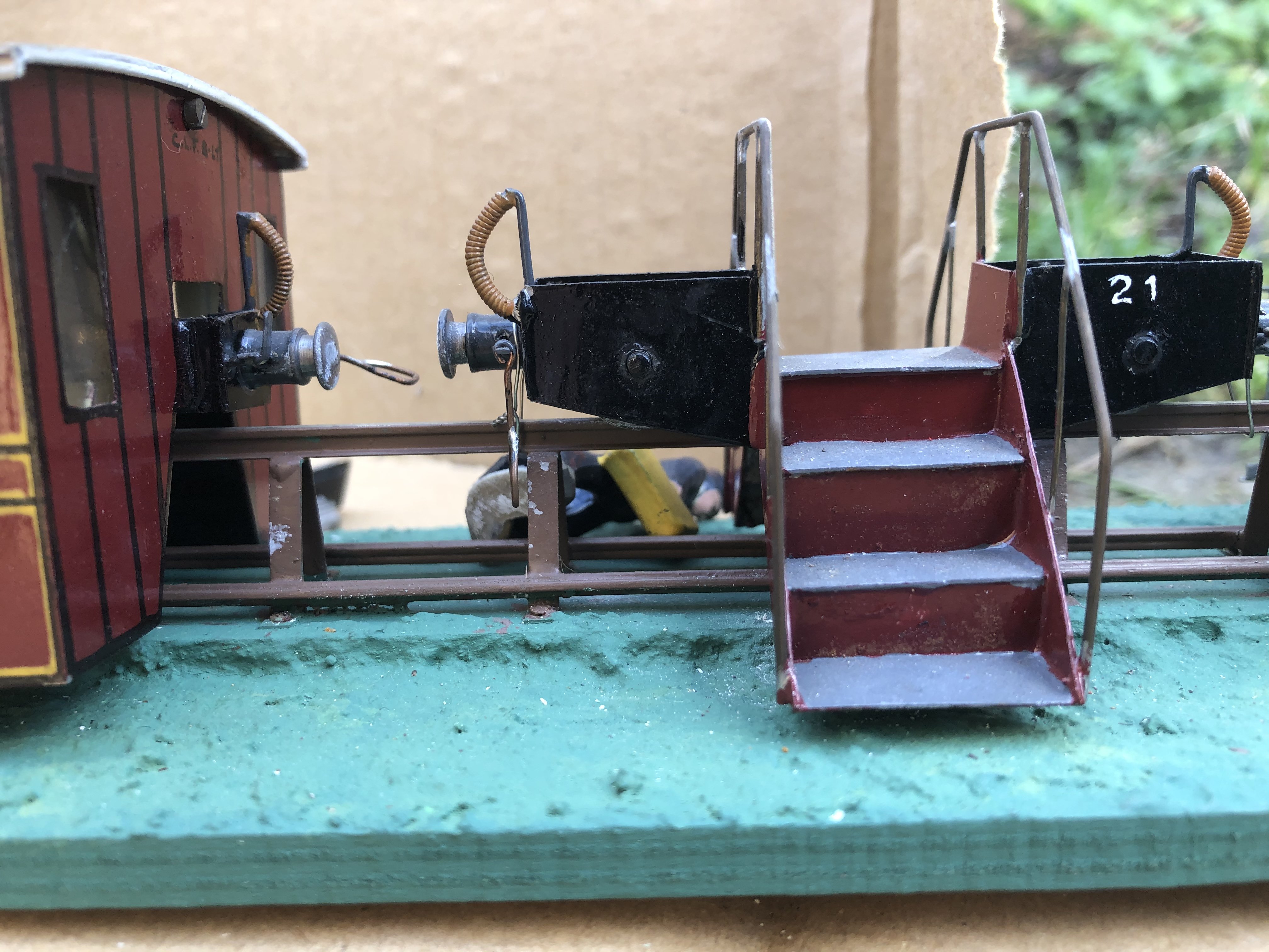
The full Lartigue train on its section of trestle track, as it will displayed once I find space for it. Now, in the immortal words of the Amurrikan tourist: “I gotta question for you”: Does anyone know if this set had previously been mounted on this small section of track when on display in the castle? One of my learned colleagues in the Record Society told me that he thought that this whole train was actually operational on Fry’s attic railway. Is anyone here able to confirm or deny this?
-
Very much so, Brian. His attention to detail, given the equipment available at the time, was exceptional. For my own personal interests, detsiled examination of livery details has yielded much important information too; looking close up at the lining he did - all by hand - and the extremely intricate shaded numerals and lettering on things, is quite remarkable. He had unparalleled access to drawings, as he worked in Inchicore when my grandfather was there in the loco drawing office, so they knew each other. Without boring everyone with the details, he almost certainly got several of his mounted crests, plus at the very least the Drumm trains and Bredin coach drawings, ftom my grandfather, and he knew many other prominent modellers of the day like the late Sam Carse and Drew Donaldson. He’s bound to have known Bob Clements too, as his daughter is aware of the name. He built two models for Drew which got some reason remained in his collection and are now on show. They are a 500 class and the eight-coupled shunted No. 900. Drew famously detested the GSR grey livery and insisted that whether they ever carried it or not, all his models bar a few had to be in lines CIE green. And thus it was, bar a very few. One (now in Cultra) is in MGWR green and a couple are in the GSR lined green, which real life was ONLY used on the three 800 class. Naturally he knew many of the “old guard” in the IRRS like the Murrays and so on. He also knew James Boyd, the famous railway authorities. Boyd refers to a chance encounter between the two at Skibbereen in his last book... best to read that one yourself! In terms of drawings, once the Drumm train goes on display, the eagle-eyed will see that the cab ends are different from real life. This is not due to an inaccuracy in his modelling, nor an incorrect anything; it is due to the fact that the train AS BUILT differed from the drawings my grandfather had done - and Fry built his model off-plan!! Other than that, to answer your initial question, as far as I can see (and I stand to be corrected) the dimensions and details of the models are spot on. Naturally, being me, I can’t help highlighting - purely for the information of modellers who may someday want to know - the very few livery variations. GNR “S” class 4.4.0 No. 170 is too dark a blue, and several slight errors on a couple of the Dublin trams have been identified by a gentleman who assisted me very greatly with tram info, as he is an absolute “go-to” authority on Dublin trams. His GSR loco liveries have a couple of variations too from the real thing. But this is really serious rivet-counting stuff - overall a truly magnificent collection, now available for many future generations to enjoy and be educated by - which is precisely what Fry wanted.
-
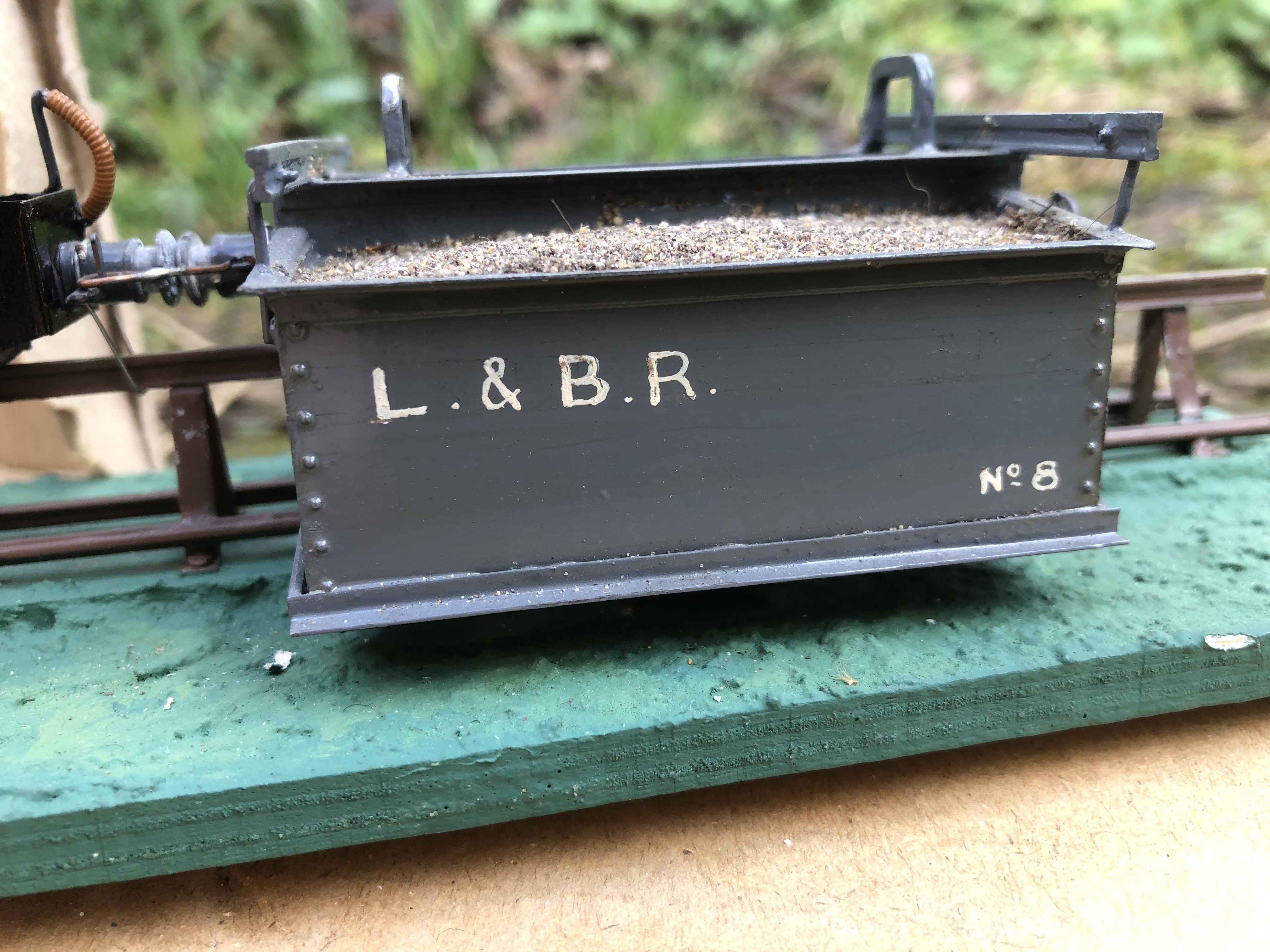
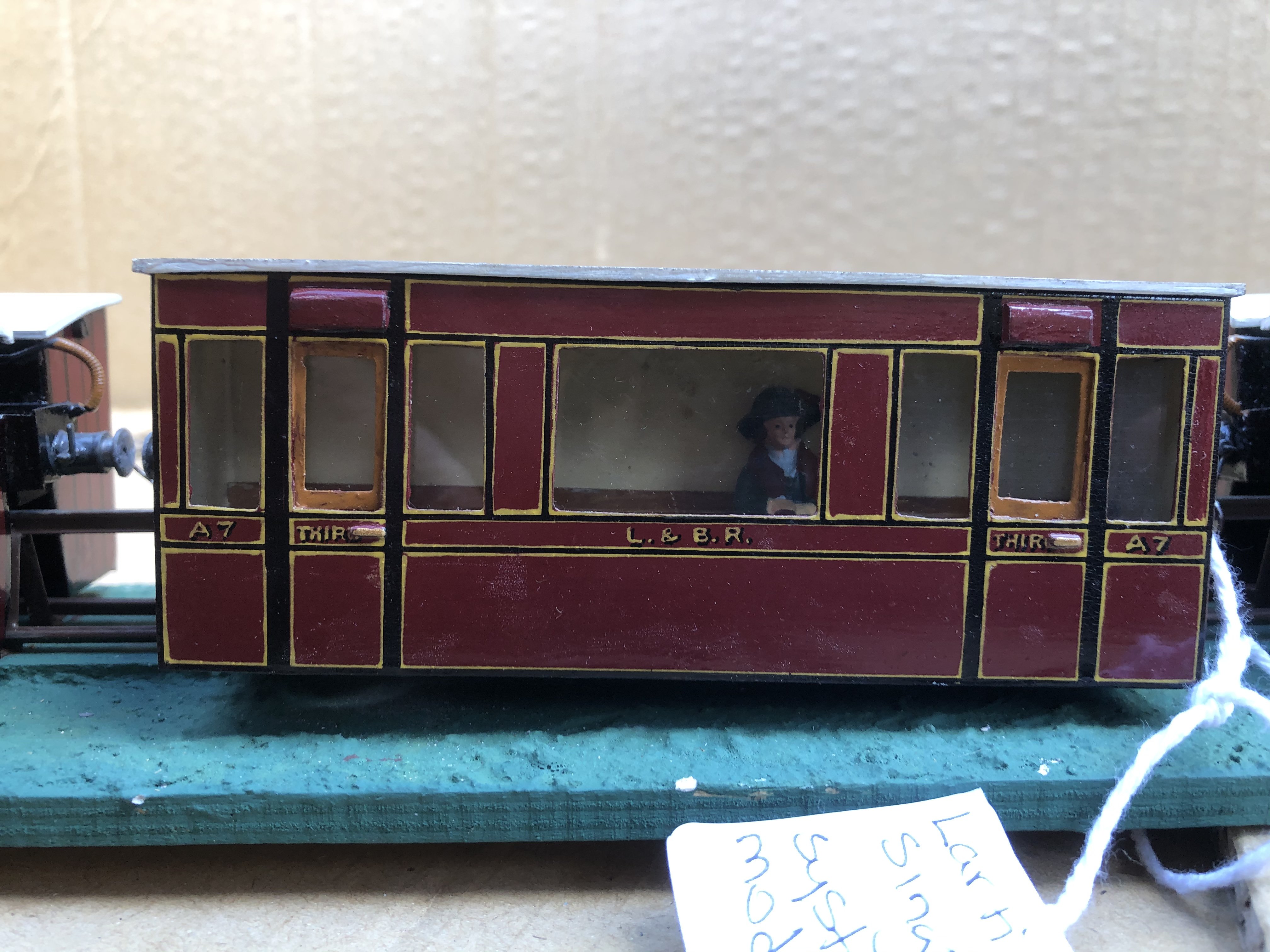
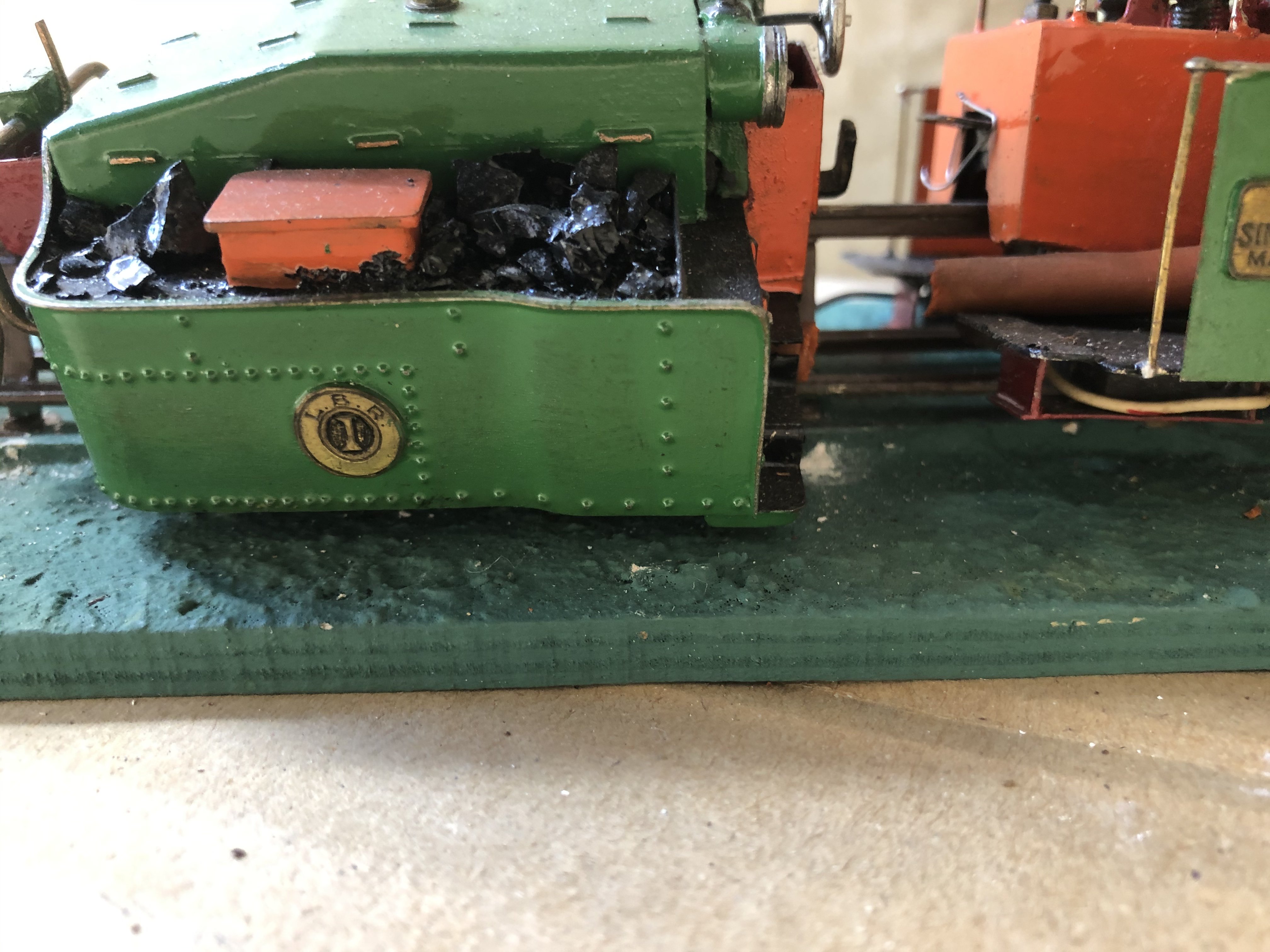
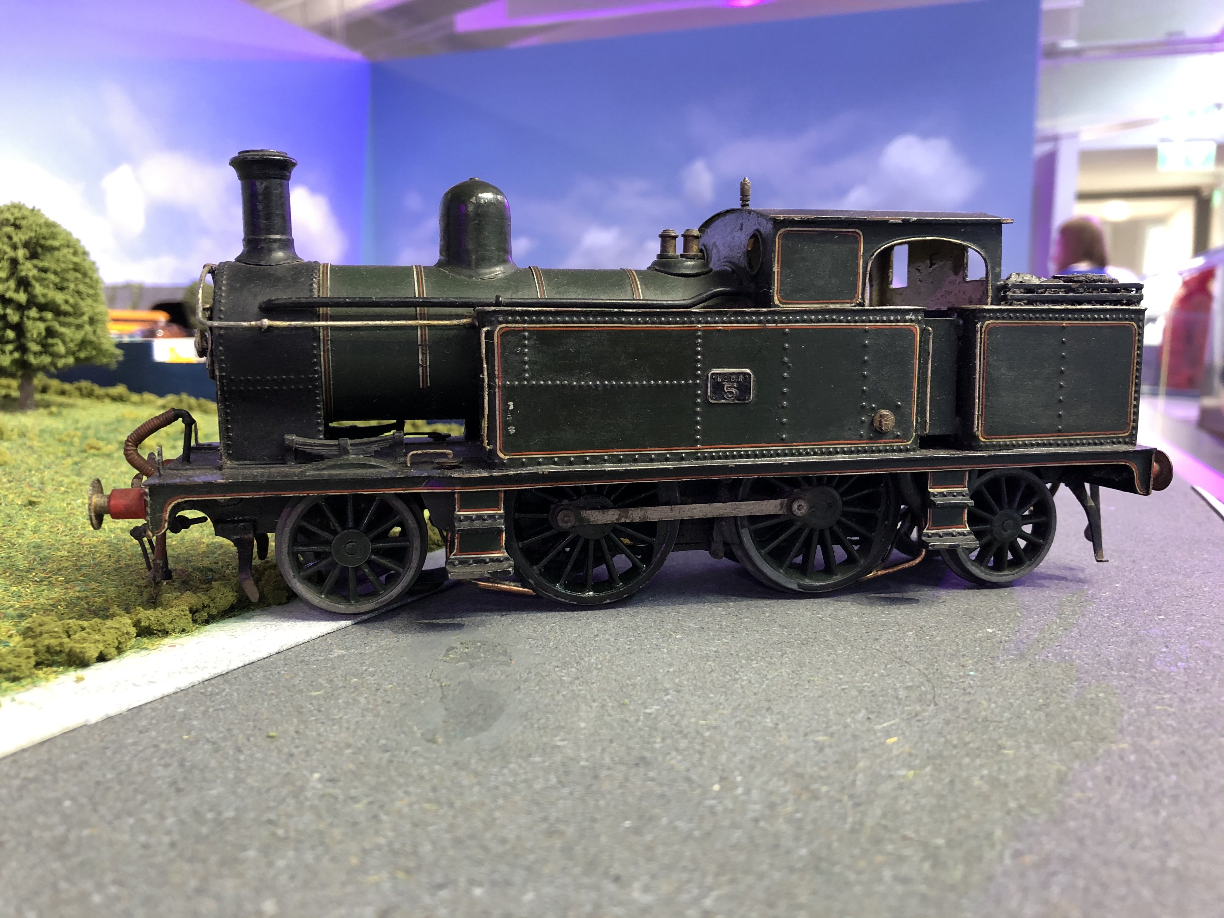
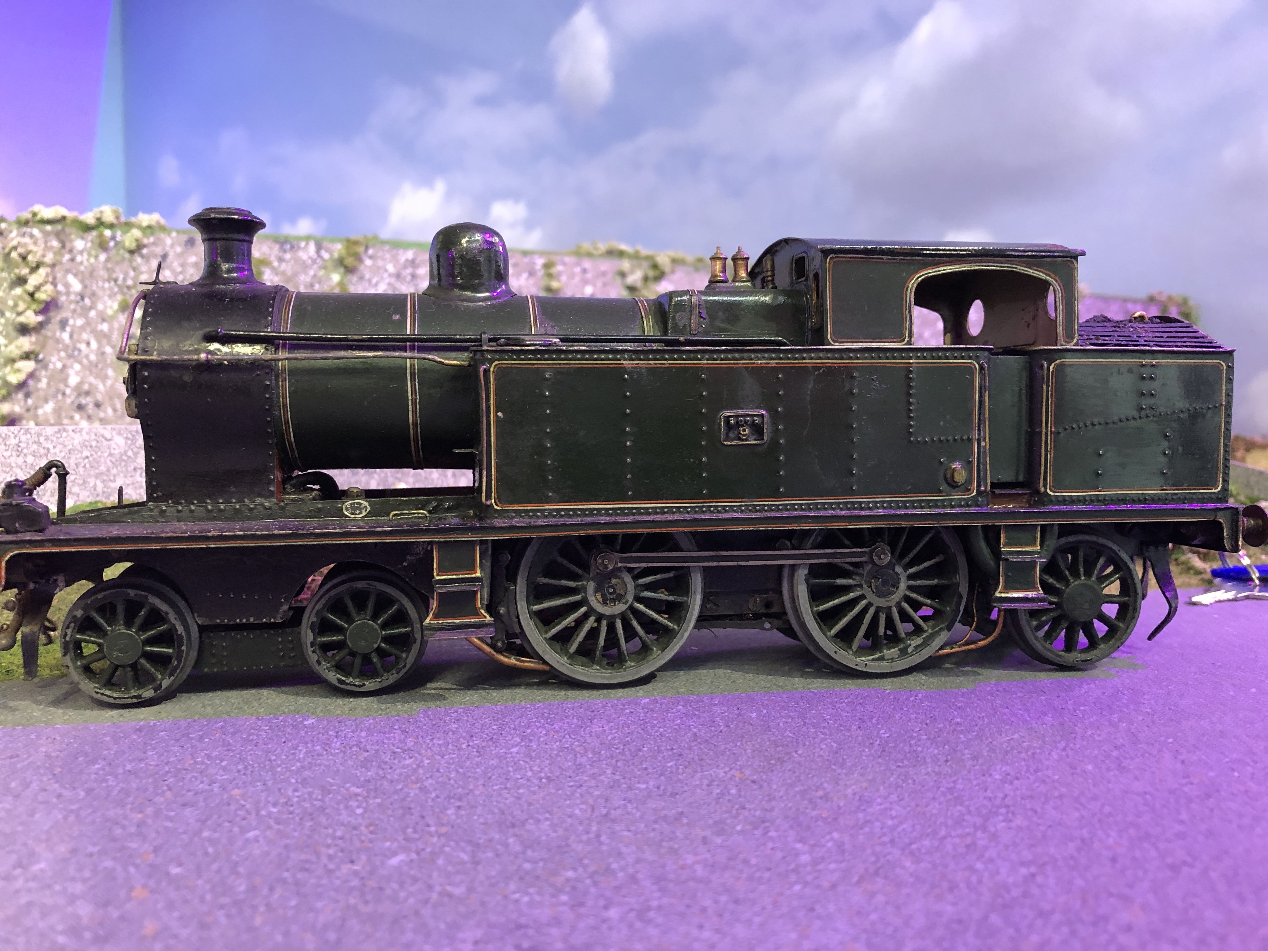
The Midland tank engine was "weathered" for the Castle layout, as were some other items. A decent repaint would actually make a nice job of it! As far as I can see, the L & B thing was only ever meant as a static exhibit. The loco appears to be attached to the track, and it would seem the whole train was just intended as a static display.
-
And of course there have been previous threads on here about nicknames given to types of locomotives and so on.....
-
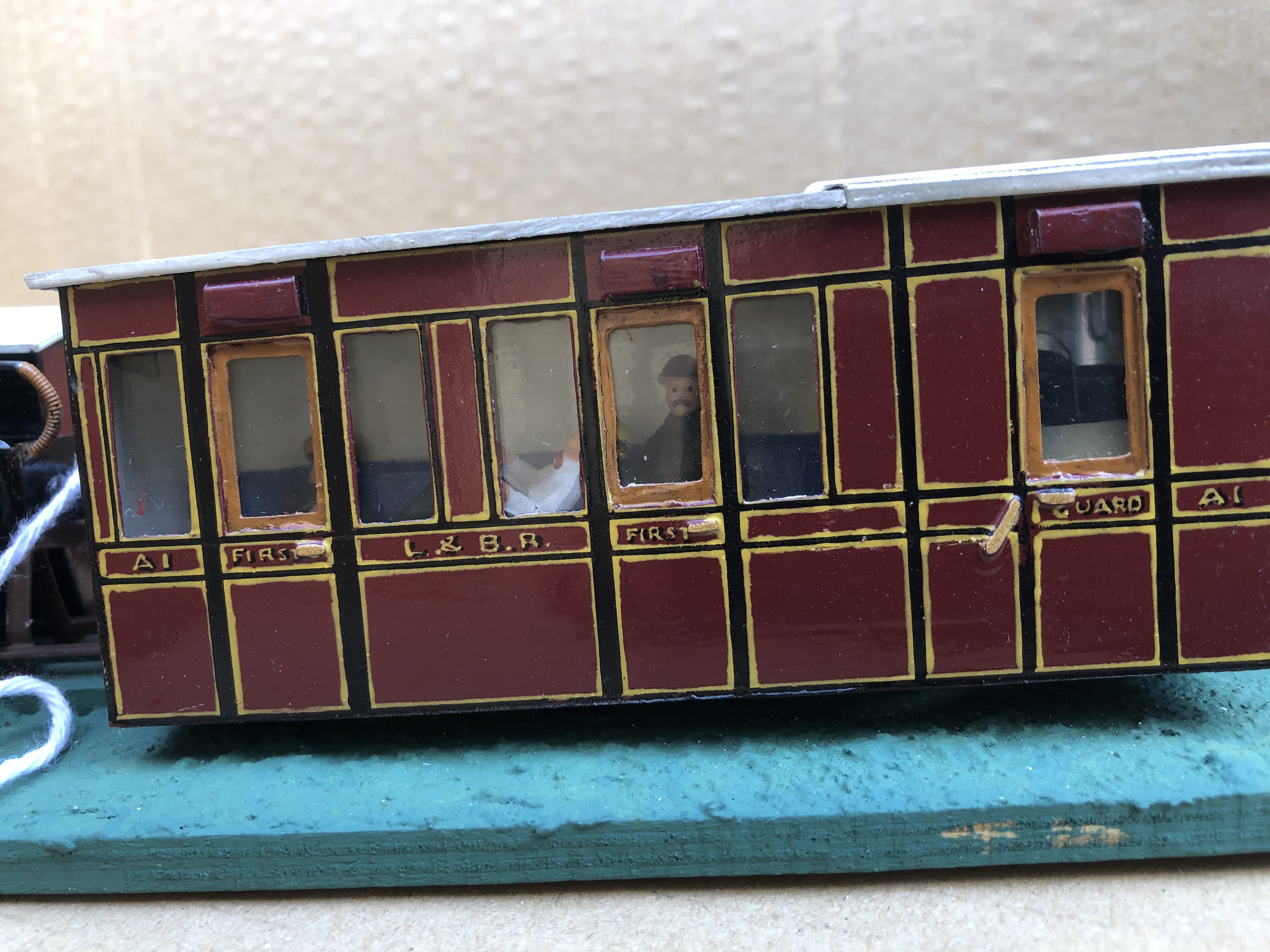
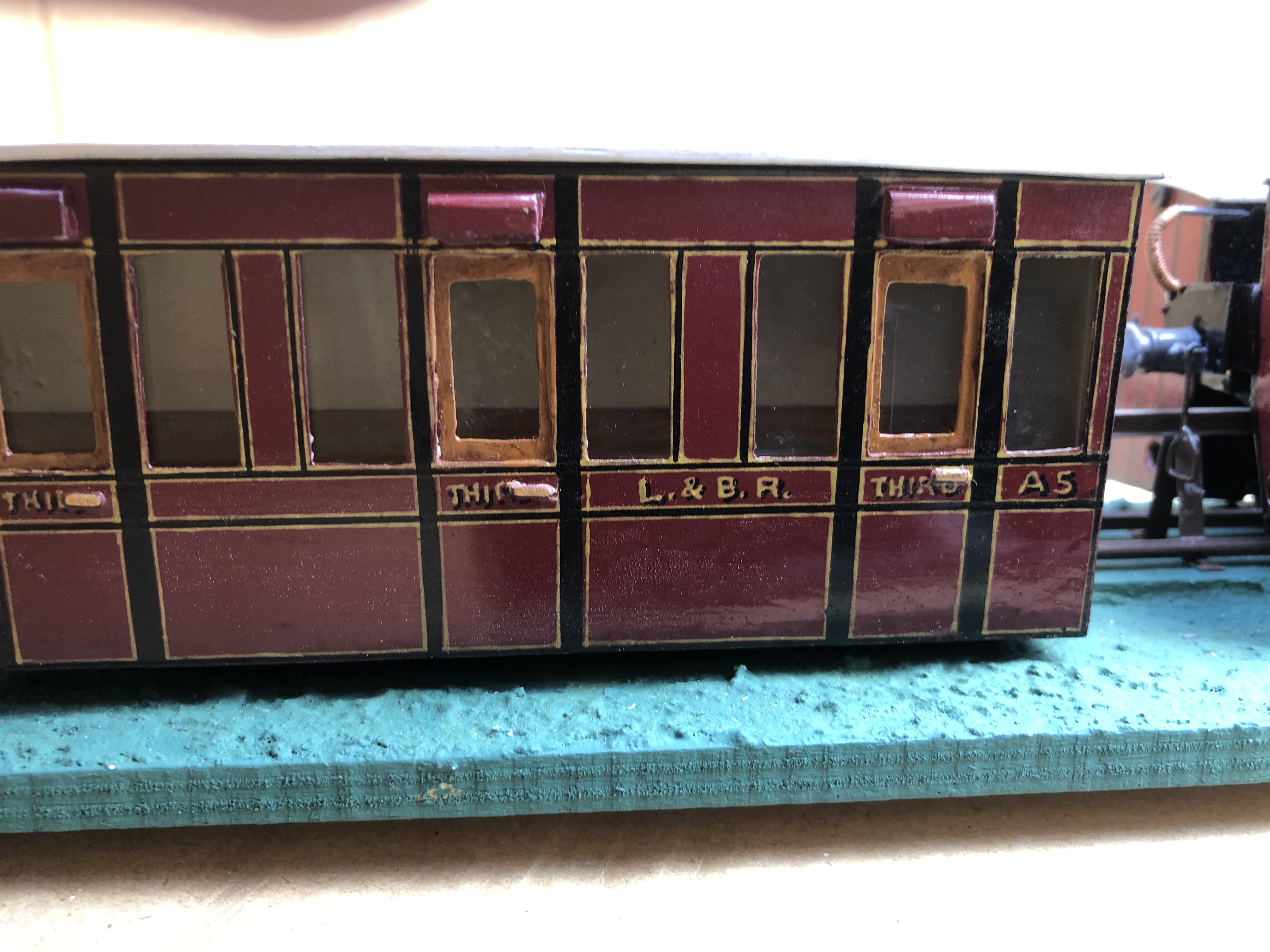
As readers will know, the items which ran in Malahide Castle weren’t made by Fry, but by up to seven other modellers. Here are a few out of the last box to be listed today....
-
He must be dead some 40 years now, as he died just after I started volunteering at Whitehead. I had only met him once, and very briefly, but the impression remains - he was a larger-than-life character, all right!
-
Not that I ever heard - and given my age, I was old enough to remember any nickname for it from day 1! (1968!)
-
The Lartigue stuff. This is the only Fry Irish stuff not yet on display, as there isn’t a suitable cabinet. One will be ordered.
-
I thought this might interest people. This is how the SSM six-wheelers are articulated underneath. There are four of these in Malahide - two each in CIE and GSR liveries. They run very well. IMG_1048.MOV
-
Not to my knowledge, DART8118, but I will be speaking next week to one who will know! I should also be speaking to Fry’s daughter, an absolutely lovely lady. She has followed all developments since C L Fry died in 1972, and she can tell you absolute chapter and verse of all moves; some of which had her support, and others she was not happy about back in the day. A book about Fry and his achievements is under way. I am very anxious to ensure that she thoroughly endorses every syllable in it! I will see what I can find out about DLR Council.
-
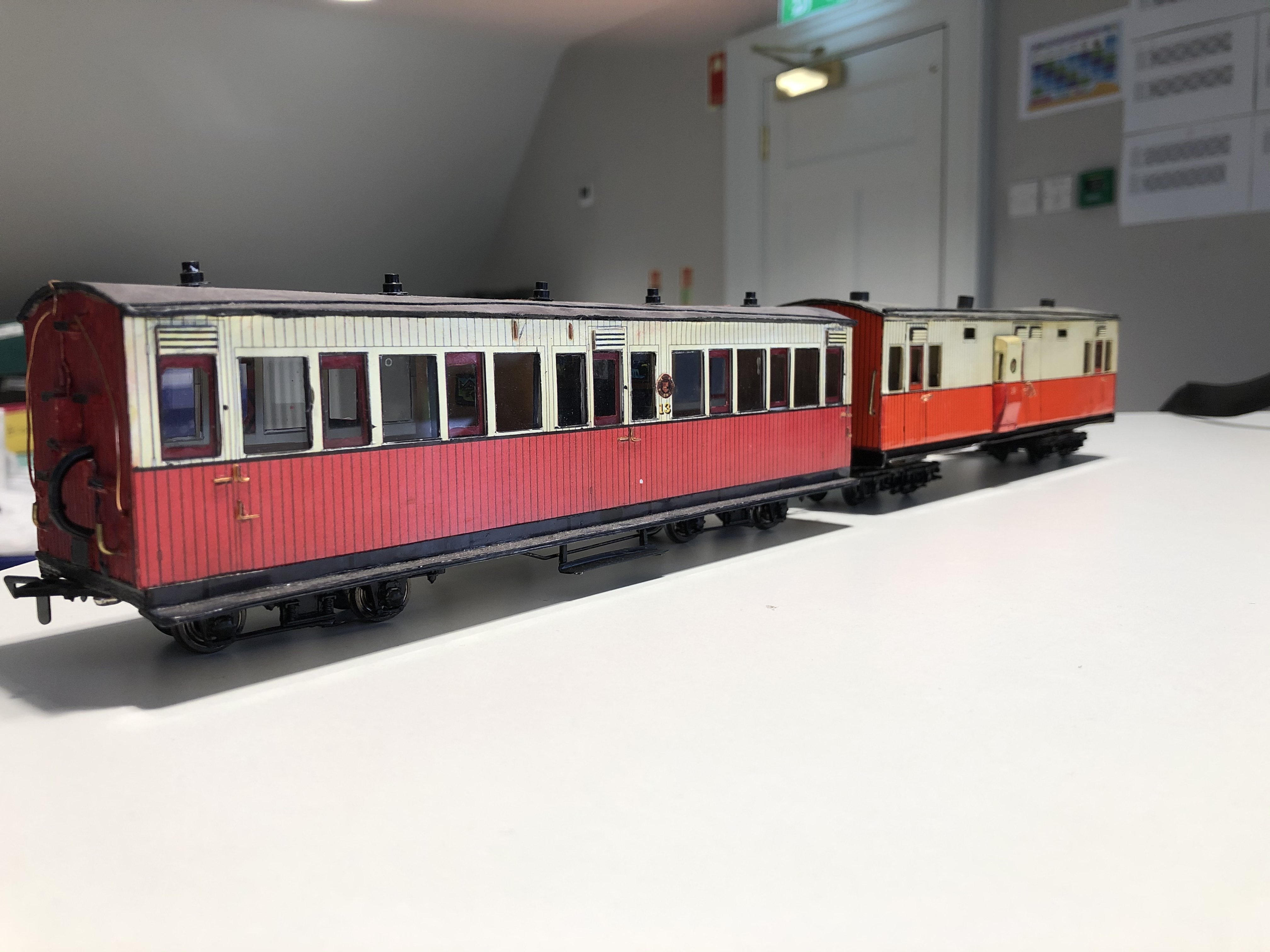
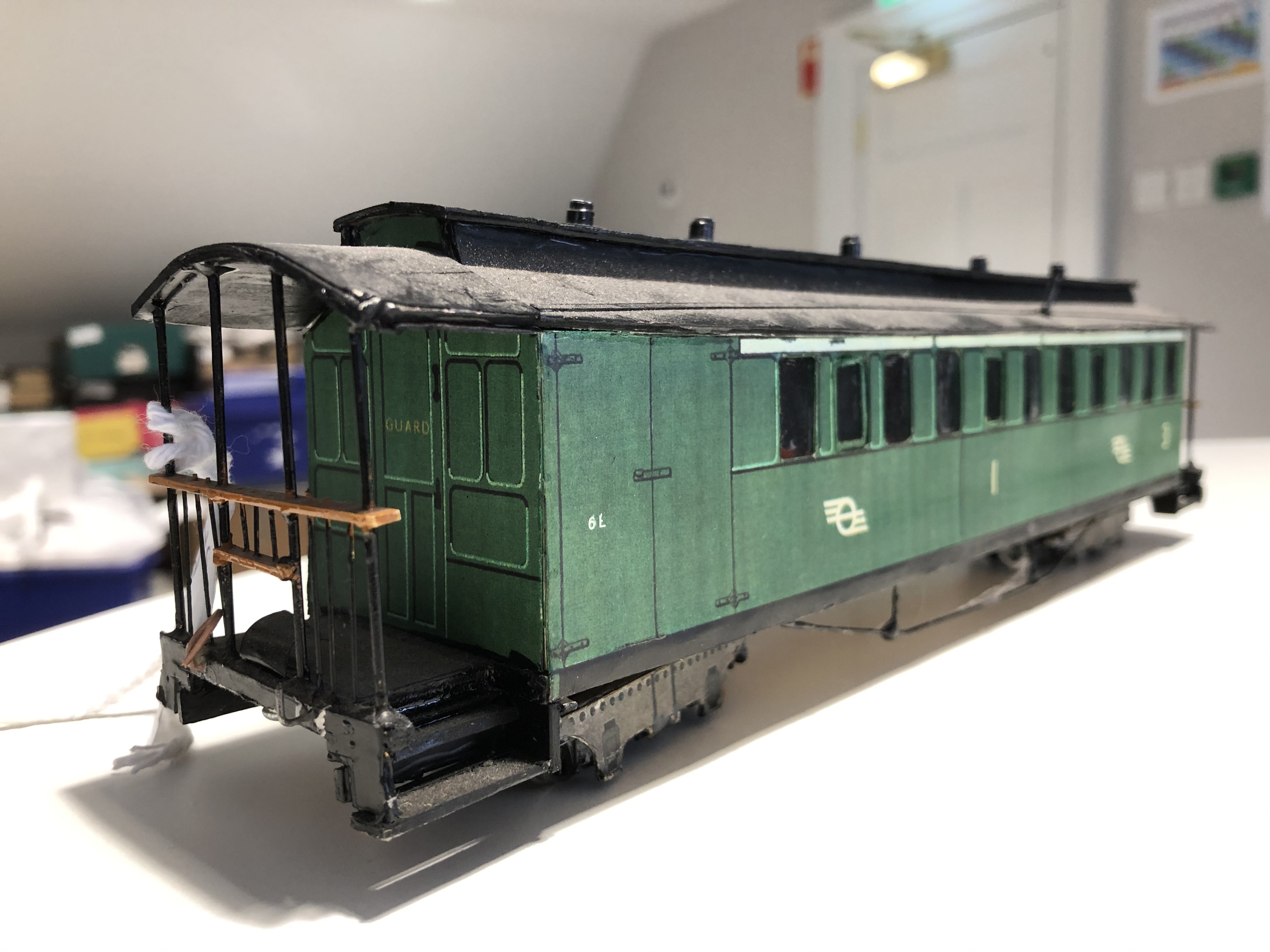
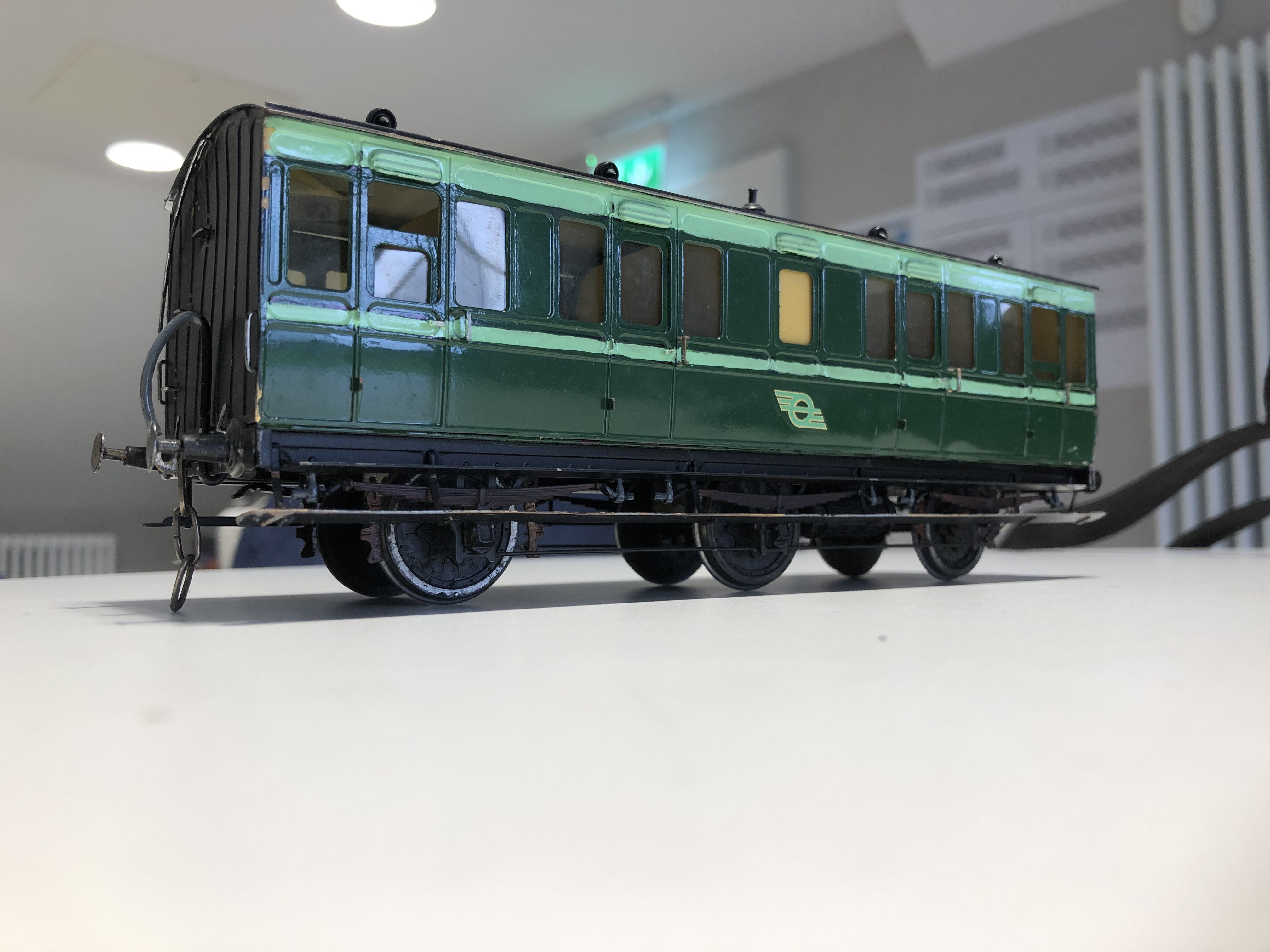
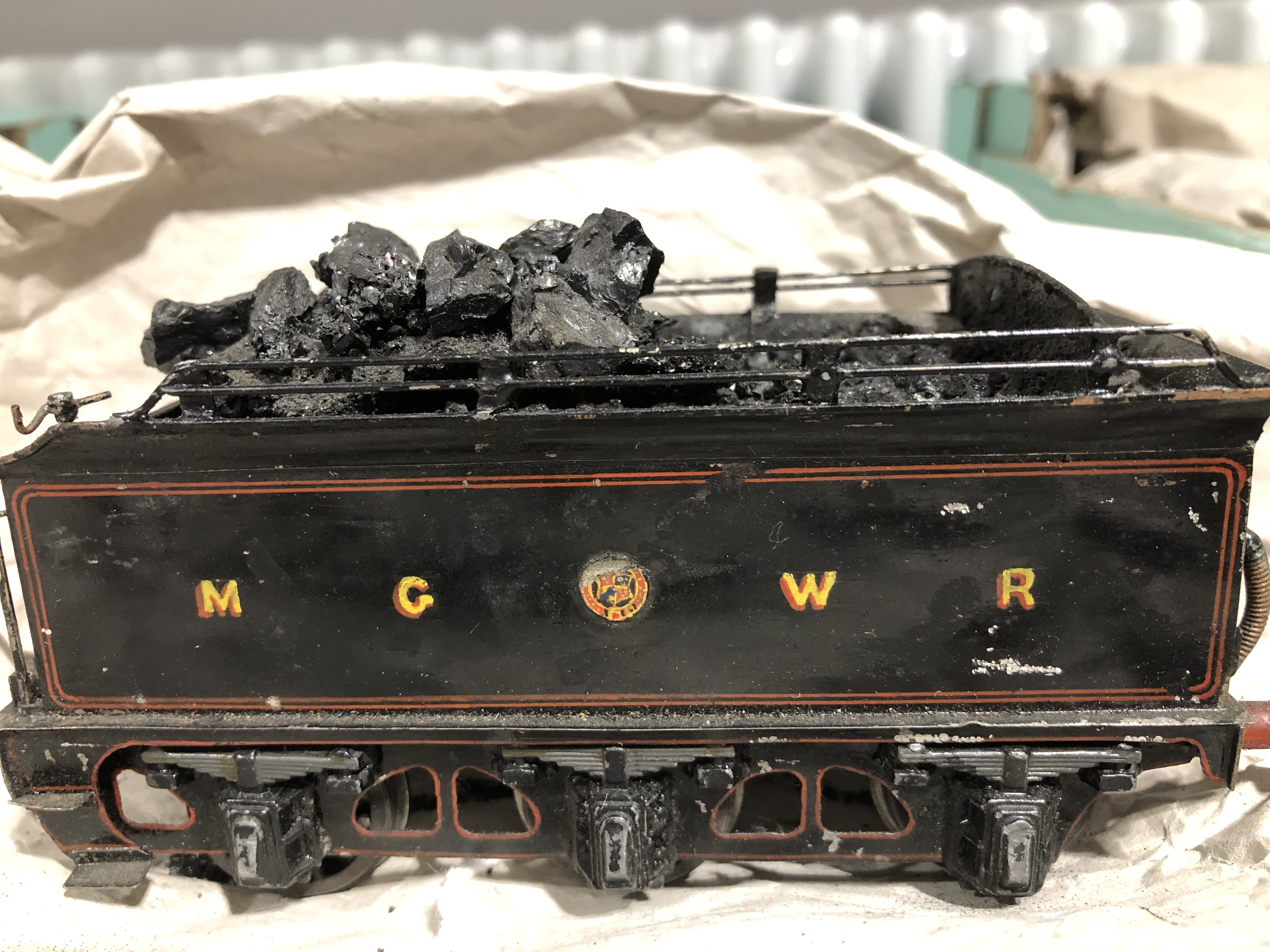
Had these out today to show someone... Two BCDR locos (livery note; this is actual BCDR green - No. 30’s Isle of Man-esque green in Cultra is WAAY too light! The MGWR tender has, I am sure, a matching loco somewhere; thus far it maintains its secrecy. The six-wheelers are the excellent SSM kits. The very nice Donegal carriages and C & L brake compo No. 6L are very nice alphagraphix kits by the look of them. These were made up by Des McGlynn. All items shown here, MGWR tank loco included, were made in the 1990s / 2001 for the Malahide Castle layout, rather than by Fry - with the exception of the two BCDR locos. Fry made them.
-
My error entirely! I knew about the nationalisation dates but the canal detail slipped my mind!
-
It’s become “colloquial”, though. With anyone involved in developing it long since passed away, hopefully there’s nothing derogatory about it. It’s been referred to as such for half a century now anyway.... “Wheel” is, of course, a very appropriate name, though with relatives in Inchicore myself I never heard of it!
-
1. The “Flying Snail” (as in my avatar thingy) was used by the Dublin United Tramways Co on their trams and buses from 1941. They had the company name in Irish across the central bar. In 1945 the DUTC was amalgamated with the Grand Canal Co., and the Great Southern Railways to form CIE, and the entire organisation used it, without any wording across the middle. I am unaware of any use of “on the ground” in the canal world, other than newspaper notices, but that’s another story. Evidently, the snail was based on the London Underground logo. 2. The “snail” was replaced by the “broken wheel” in 1962, but it would be several years before the new logo was a common sight; goods vans were still carrying occasional examples over ten years later - the last “snail” I saw on a goods van was, I think, 1976 or 1977. 3. On the breakup of CIE into operation g subsidiaries in 1987, the “set of points” appeared. At this stage they stopped applying any logos to almost all freight wagons. I saw a few ballasts with it, but 42ft flats and fertilisers were niw pksin brown without logos. That said, tired and weathered “broken wheels” could be seen on a few ferts right until they stopped running. 4. The “3-pin plug”, referred to above, about mid-1990s. 5. The “N-shaped flag”, 2013. I agree that it’s not by a very long way the most impressive logo I’ve ever seen!!!! Whats next..........?
-
CASINO MUSEUM & FRY COLLECTION UPDATE Now that the Casino Museum is open, up and running, some final tweaks still need to be made. A little tweaking of the interactive displays will be made over the coming weeks and months, and attention is now being turned to the future os redundant material from the erstwhile "Castle" layout. Remember, the layout in the castle was NOT Fry's, nor were the locos and rolling stock which ran on it. A full evaluation of this very considerable amount of material is being conducted over the coming weeks, in particular what if anything can be done with the huge amount of stored pieces of the castle layout. Anyone got a heated attic about 55 x 30 feet, upon which a very considerable weight (many tons) can be placed?!! Within the Casino, visitor numbers are healthily increasing and it is my hope that some of Fry's British or mainland European models may be able to be displayed. Currently, there's no room other than one small display case.
-
K801, in a perfect world they could - and what a highly scenic line that would have been. I believe that the original promoters of the Youghal line had ideas about going further....... pity it didn't happen.
-
Indeed it is, though as you can see, covered in weeds and sundry gunk....
-
Am I right in thinking we're looking at mass closures, 1957-63-style, or BnM railways in the next couple of years?
-
If it’s of any use, I made some card models in my teens and I used matchsticks to strengthen and strsighten the corners inside.
- 19 replies
-
- 1
-

-
- rolling stock
- card
- (and 1 more)
-
Some of our modellers do the 21mm gauge track - it looks so much better!
-
CIE-built 1950s Wooden Coaching Stock (Pre - Laminate Stock)
jhb171achill replied to DiveController's topic in Irish Models
Very true! And many another dangerous practices too..... -
CIE-built 1950s Wooden Coaching Stock (Pre - Laminate Stock)
jhb171achill replied to DiveController's topic in Irish Models
Indeed, very interesting info. In my days restoring RPSI carriages, I never recall any with asbestos either. Locos had it of course, and in the days before health and safety was invented, it was just pulled off by hand and put in the bin! -
Goes to show how we've moved on, again, and I've said it many times before, thanks to the great crop of model-manufacturers both kit and RTR, that we have now. It should always be remembered by all of us that these guys are putting good-sized five figure sums into the production of an item and for what commercially is a very small market indeed. Praise be to them all! Sure back when I was a mere stripling, back when pussy was a kitten, Irish modelling meant crudely painting a BR Mk 1 in orange and black, or sticking paper sides over it, carefully coloured in with marker pen! Actual RTR stuff? Pipe Dream!